Howdy, folks. Let's get our shirt on, eh? Seriously, no one wants to see that... cover it up. Before we get to the new blood for the week, our regular updates will be useful: specifically, go check out my favorite "found art" collage piece,
Deep Blue, now up for voting at DBH. It really creates an imaginative world, and certainly if other people can create empires on worse source photos, why not allow a sweet piece like this to do the same?

Also this week at
Design By Humans, fhigi25 has decided to make a play for one of my favorite new voices in tee design. Frequent readers might recall that this isn't the first design of his which has caught my eye (in fact, the first one was just
recently subbed to Tilteed's contest), but it seems in recent weeks he's been making a serious play for a print, and I've been seeing his work en masse. Seeing so much of it, however, has elevated him from an unknown with a sweet tee to a real contender in my eyes. Consider
The Viperous Journey. It has some really brilliant rough detail. Which is to say, you can tell the skill of the designer in the art, but it's not flawless... it's not some slick vector, nor impeccable likeness, but in some way that makes it all the more perfect. This is a perfect place for a style like that, too... from venomous beasts like the snake and the scorpion, to rough hides, like the scales of a fish or skin of an elephant, a rugged style is perfect for this piece. I don't understand all the element choices (the fish and bird neither fit the dangerous beauty not the sinewy twists and turns of the other elements), but I do know the piece looks stellar, the style is unlike the average tee designer, and the artist could easily become one to watch.

Also potentially worth watching is new contest site
Impact Threads. They boast of a longstanding print pedigree, which is to say they've been printing tees for clients for a while before deciding to also run a contest-based printshop. While this comes with a site that, for lack of a better description, LOOKS like a run-of-the-mill print shop's, it appears they've put the money they've saved into the prizes... if these guys can keep a regular flow of new prints, their $2K payout all but assures they'll be finding some seriously solid work. For starters, though, my fav on first browse was
Nought-o-naut, by smokechapel. For all I know, smokey might be a big name on the indie circuit, or a new handle for an already known name, but he's new to me, so props to him for the brilliant marketing move, for starters: by sneaking in during the earliest days of the site, where subs are few and often from opportunists who don't have the luxury of printing at more established places, he's positioned himself as a front-runner easily. For me, of course, this is printworthy in any pack: it's a nautical wonder of old-fashioned diver's helmet and curious cephalopod. The decay here makes it all more ominous (as a helmeted octo should be... that sort of thing knows no fear!) as the apparatus is no less weathered than the octopus itself. Probably one bad-ass critter up in there! The piece is impeccably illustrated, and it's the sort of piece where that's good enough. It's self contained, visually intriguing, and the pen-and-ink style, strong enough to carry a piece by itself, is all the stronger on a basic white tee. Not every drawing is a tee, no matter how attractive or elaborate, but the shape and style here would make it hard not to suit any medium. It's always exciting to see what the new sites start picking for their contests, because there's always that chance of something different taking the crown than would win elsewhere. While this piece would be totally at home shopped around Emptees, I see no reason it shouldn't be one of the early victors here instead.

These days, perhaps even more cliché than the octopus aesthetic (one I'm comfortable admitting I've bought into) is the bunny. Bunnies are cute. Bunnies are adorable. Bunnies are popular because they are cute and adorable. There's not much that needs to be done to one to spark some juvenile "awwwww want" gland in the brain, so most people don't do anything to them, letting their awwfactor substitute for any creativity or artistry. It's sort of like grilling an unseasoned burger, but cuter. Thankfully, haha.sg has taken on the most adorably lazy concept this side of an Ewok and made something special out of it. Simply entitled "
Rabbit[s]," it is what it says: a rabbit on a rabbit. What it brings to the table, however, is a definitive artistry. The layers of different rabbitness are wonderful, and contrast on many levels. The smaller rabbit is more defined, for example, than the more shadowy, larger under-rabbit. The rabbits are split into three segments, each of which brings a new style to the piece, but even between the same segment, the rabbits are different. The head contrasts from predominant pink to a nice springy yellow; the body is a meadow scene, where the larger of the two acts as backdrop for the smaller, here represented in a natural way; finally, the tail end brings us into outerspace for some reason... here the smaller is surrounded by a wireframe while the outer reaches are simply spacey. All these differing pieces look attractive together, with each one executed wonderfully. It doesn't skimp on what people love about the critter, but its use of art elevates it to something far more original and attractive.

While we're on the subject of tees that are what they say they are, it should be mentioned that rabbits aside, this has been a trend at
Threadless this week in general. With Lilith being a predictable creativity bust (somewhere in the range of 2million tees with an unattractively rendered girl-with-guitar, with somewhere in the range of 3 creative offerings), and one of the
most bizarrely specific community contests in the process of scoring, it's not hard to find tees that are pretty much exactly what you'd expect them to be. Enter "
Here is a Tall Bird," by Riffmaster18. Here, you will see a tall bird. Shock of shocks! There's no reason why this concept should make a good shirt. Yet somehow, it does. The bird really is absurdly tall, and almost all leg, which lends a bit more humour to the tee besides the to-the-point title. The placement, just off-center enough to not boil down to one narrow strip down the middle, helps the wearability, and while I'm normally less than impressed with the halftone glow, it gives a little extra meat to a design (which, with those thin lines of legs, it could certainly use all the meat it can get). And while it literally is just a tall bird, on a shirt, it's a tall bird with attitude. The nonchalant crossing of the legs at the ankle actually adds more to the character than you'd expect. It's as though he's standing there thinking "yeah. I'm tall. So what?" Very calm, cool and collected. It's somehow even better that his knee is not at all bent in this action. There's something about the piece that simply becomes a perfect storm of oddity, all conspiring to make a simple concept into a wearable one. It's not my concern WHY that happens so long as it does.

We close the regularly scheduled portion of this program with one of the more overtly feminine pieces I've featured here:
Tiepetaak, by toonpoot. It also boasts one of the odder title/artist handle combos in recent times, as well. Now generally, it is not for me to suggest that a tee's blank is masculine or feminine: a good tee is a good tee, and can be rocked by anyone. That said, however, I own a pink tee, and even at your most confident, you just are taken aback by just how soft and pink it is. For those of us willing to take the plunge, however, this has a lot to offer. Color really does make this tee, and it probably simply wouldn't work as well on any other blank. Honestly, it almost reminds me of those cell diagrams in old biology books (my teachers would be proud I've remembered -anything- from science classes) with its color scheme, circular arrangement, and general lumpiness of content. The style here counts for a lot too... I love the diversity of weird little dudes in this piece, as well as other things and debris surrounding it all. It's fun and warrants repeated views, and while it may have some people detracting it from a "don't look at my chest that long" point of view, I've always felt that a good tee is something people WANT to look at, not something you long to shy away from viewing, like someone who still thinks Coed Naked is funny.
And now, for Contest Watch Extra, the part of the program where we turn to shirt.woot's quarterly doubletake. In all honesty, this quarter contained some of the most unimpressive designs possible to revisit, but there are definitely a few worth keeping an eye on for the upcoming Editor's Choice picks. From the top, we have littleclyde's
Sunsplash, a charming piece perfect for the spring/summer transition;
Take a Taco for a Walko, by odysseyroc, which is probably just what I don't need (another shirt with a taco on it);
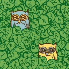
Little Leafy Friends by brockart, which is really a sleeper favorite with its smart placement and size; and
ncheremnykh's Birdsong, which for all I go on about natural illustration vs. slick vectors, shows the best of that simple and smooth style. I'm not as confident about my picks this quarter as last (nor do I expect to buy any, let alone the 2/4 from last time), but any one of these could print, and would deserve to.
 We're starting this week with a shirt that is not going to print at woot, because it's not even 100 votes from the bottom of the fog. It is my hope that, in highlighting it to start with, it will make my ever present frustration with the-voter-at-large obvious, like a teacher breathing a sigh of relief when Dumb Bobby finally understands contractions. Not that you guys are Bobby... your taste in blogs suggests otherwise... but you never know who might stumble upon this here screed. So here we go: Flight by tgentry. This is skillful art, for starters. The linework is about as realistic as you can hope for from extinct animals never seen by man, yet done in a chunky style that makes it all more fun. The one-color print is amazing, adding so much depth and so much character in the halftones and the outline-free design. This is a piece done by someone who clearly is earning his votes through artistry. However, it's also a piece which takes that artistry and combines it with a wholly appealing concept, and a totally fun concept. The flying dinos have a shred of childlike whimsy mixed with a dollop of "EPIC WINZORZ" and combined into a tee that feels comfortable and familiar without being a sellout or theft. So obviously it came nowhere close to winning. I'd dare you, the fine reader, to look at the potential selections and not be appalled... a good half of the tees that DID make the cut feature in as some of the worst designs I've seen at woot in a long time. It's lack of inclusion in the fog at all should give those of us who care about graphic design pause: what are we doing wrong? Is there any way for a quality design with a shred of originality to make it in this crazy world? Probably not. And so long as we're standing idly by, it'll continue that way.
 Of course, there's a part of me that looks at a design like Flight and says "well, sir, congrats on your third Threadless print." Even as the tee megapower begins to devote more and more cloth to nonparody and unoriginal mash-up, it's still the sort of fun romp that would almost assuredly do a bang-up job in scoring. Sadly, however, I tend to find more and more often that I'm being enticed by things that really have little to no chance there. Consider Sleeping Giant, by emory. It's actually doing pretty well in the votes, by all appearances: strong comments from diverse alumni always helps, and the vote numbers themselves seem to be just slightly higher than the norm, meaning there's buzz without manipulation. Still, this is probably just too out there for a print, no matter the hype. For my purposes, however, it's pretty perfect. The style is unique, the concept is intriguing, and the colors are spot on while also being limited. It's not really like anything I've seen before... sure, there have been other concepts of giants, or cities built upon creatures, or such things, but there really is something special about the style of this. I haven't really seen anyone execute things like this before. Also, I like how the giant seems to be a known part of the landscape instead of an unknown... it's as though the villagers, despite the title insisting he's sleeping, slayed the giant and simply rebuilt over him and around him, rerouting the river to flow through his mouth, planting trees on his skull, etc. The landscape overtakes him, and turns him into little more than a mountain or statue. The execution choices for the giant, therefore, add a lot to the story here, and create its own story. It's a unique piece, and that uniqueness is not only its blessing, but I fear could be its curse when print time comes along. Oh, how I'd love to be wrong.
 Probably a more surefire bet is ben_chen's Be Careful of the Moth, which is a conceptual powerhouse for starters. It's the sort of concept Threadless made its mark with, with an outlandish scenario that's nevertheless totally relate-able and totally wearable. This appears to me to be another minimal color wonder (I see four, and a lot of texture to be found within), which is always impressive. But back to that concept... moths are big. Pretty simple, pretty obvious (I dare you to say you've never been freaked out by a particularly large moth), but in being simple, the design is able to really become a personalized piece. The exaggeration of the concept is what shines here, but the palette choices are just as perfect... they create a perfect darkness and woodsyness, which helps anchor the scene, while the glow is just right to tie the moth in... after all, moths are known to be attracted to light, and this big guy is no exception. A great example of how an artist can inhabit a concept when they just take the time to think about it.
 What is missing so far, though, is pure beauty at work. I love iconic, simple, smart tee graphics... the sort of thing that makes use of the tee canvas in a "classic" manner... but if tee graphics can't be more, the classic tee means nothing, Thankfully, badbasilisk has brought us an absolutely stunning piece this week: Dornroeschen (Sleeping Beauty). It's beautiful and tragic and in and of itself its own sort of "limited palette" like the above (six colors for this sort of detail and perfection is a bargain). The graphic may not convey the sleeping beauty story conventionally (even despite all the prickly roses and the presumed spindle at the bottom) but as always, good shirts rarely show off their titles, and this is one of those times where the title's lack of prominence in the graphic means nothing, because the art is so strong. It's really a powerful image: the freedom of the bird being held down in desperation... the beauty of the flowers setting a trap. The bird is almost in a Jesus Christ pose, which oddly helps the graphic make the all-important transition from "aww roses" to unisex tee. That struggle, that poignancy and desperation evident in the piece, keeps it relevant and universal. I'd hardly be shocked to see this in a second life as a post-hardcore band's tee, the name of the band entwined in the leaves and thorns, though its versatility would be lost in such a situation. As it stands, it could be a graphic for anyone who has ever struggled, or anyone ever hurt in love. It could be a tee of beauty or a tee of pain. It's raw and fragile in the same glance. Graphic tees were meant to evolve to this, not devolve into bad slogans and "that's what she said" jokes. I hope to get to see it happen for this tee. Also, y'all should click through to check it out in black, which also looks incredibly sweet. I'm just a mint fiend.
 Finally, over to Tilteed, which has been enjoying a slow influx of nevertheless quality tees over the past month or so. While I am all for, but am also wary of because I know damn well we're looking at a lot of print competition for not a lot of contest spaces. Anywho, the latest must-vote, for me, is rocketpark's Ghostly Town. The execution is lovely, with a charming cartoonyness mixed with some lovely ramshackle buildings, and smart, minimalist colors (a trend this week for sure). I like that the palette allows the buildings to fade into the tee, making them ghostly themselves even surrounding the ghosts. I also totally dig the ghost personalities (one of the things I find the most fun about tees like this is how designers can fit worlds of personality into simple shapes). One smart decision here, as well, is making the town feel like a stereotypical "ghost town". The ruins speak to the images we conjure up of deserted western towns, and even the ghosts themselves are a bit western... one with its silly mustache, another with it's big hat, still another six-shootin' to his heart's content. It's fun, but also just a bit creepy and thought-provoking, as is the wont of the ghost-world. Should make a great tee.