 Also this week at Design By Humans, fhigi25 has decided to make a play for one of my favorite new voices in tee design. Frequent readers might recall that this isn't the first design of his which has caught my eye (in fact, the first one was just recently subbed to Tilteed's contest), but it seems in recent weeks he's been making a serious play for a print, and I've been seeing his work en masse. Seeing so much of it, however, has elevated him from an unknown with a sweet tee to a real contender in my eyes. Consider The Viperous Journey. It has some really brilliant rough detail. Which is to say, you can tell the skill of the designer in the art, but it's not flawless... it's not some slick vector, nor impeccable likeness, but in some way that makes it all the more perfect. This is a perfect place for a style like that, too... from venomous beasts like the snake and the scorpion, to rough hides, like the scales of a fish or skin of an elephant, a rugged style is perfect for this piece. I don't understand all the element choices (the fish and bird neither fit the dangerous beauty not the sinewy twists and turns of the other elements), but I do know the piece looks stellar, the style is unlike the average tee designer, and the artist could easily become one to watch.
 Also potentially worth watching is new contest site Impact Threads. They boast of a longstanding print pedigree, which is to say they've been printing tees for clients for a while before deciding to also run a contest-based printshop. While this comes with a site that, for lack of a better description, LOOKS like a run-of-the-mill print shop's, it appears they've put the money they've saved into the prizes... if these guys can keep a regular flow of new prints, their $2K payout all but assures they'll be finding some seriously solid work. For starters, though, my fav on first browse was Nought-o-naut, by smokechapel. For all I know, smokey might be a big name on the indie circuit, or a new handle for an already known name, but he's new to me, so props to him for the brilliant marketing move, for starters: by sneaking in during the earliest days of the site, where subs are few and often from opportunists who don't have the luxury of printing at more established places, he's positioned himself as a front-runner easily. For me, of course, this is printworthy in any pack: it's a nautical wonder of old-fashioned diver's helmet and curious cephalopod. The decay here makes it all more ominous (as a helmeted octo should be... that sort of thing knows no fear!) as the apparatus is no less weathered than the octopus itself. Probably one bad-ass critter up in there! The piece is impeccably illustrated, and it's the sort of piece where that's good enough. It's self contained, visually intriguing, and the pen-and-ink style, strong enough to carry a piece by itself, is all the stronger on a basic white tee. Not every drawing is a tee, no matter how attractive or elaborate, but the shape and style here would make it hard not to suit any medium. It's always exciting to see what the new sites start picking for their contests, because there's always that chance of something different taking the crown than would win elsewhere. While this piece would be totally at home shopped around Emptees, I see no reason it shouldn't be one of the early victors here instead.
 These days, perhaps even more cliché than the octopus aesthetic (one I'm comfortable admitting I've bought into) is the bunny. Bunnies are cute. Bunnies are adorable. Bunnies are popular because they are cute and adorable. There's not much that needs to be done to one to spark some juvenile "awwwww want" gland in the brain, so most people don't do anything to them, letting their awwfactor substitute for any creativity or artistry. It's sort of like grilling an unseasoned burger, but cuter. Thankfully, haha.sg has taken on the most adorably lazy concept this side of an Ewok and made something special out of it. Simply entitled "Rabbit[s]," it is what it says: a rabbit on a rabbit. What it brings to the table, however, is a definitive artistry. The layers of different rabbitness are wonderful, and contrast on many levels. The smaller rabbit is more defined, for example, than the more shadowy, larger under-rabbit. The rabbits are split into three segments, each of which brings a new style to the piece, but even between the same segment, the rabbits are different. The head contrasts from predominant pink to a nice springy yellow; the body is a meadow scene, where the larger of the two acts as backdrop for the smaller, here represented in a natural way; finally, the tail end brings us into outerspace for some reason... here the smaller is surrounded by a wireframe while the outer reaches are simply spacey. All these differing pieces look attractive together, with each one executed wonderfully. It doesn't skimp on what people love about the critter, but its use of art elevates it to something far more original and attractive.
 While we're on the subject of tees that are what they say they are, it should be mentioned that rabbits aside, this has been a trend at Threadless this week in general. With Lilith being a predictable creativity bust (somewhere in the range of 2million tees with an unattractively rendered girl-with-guitar, with somewhere in the range of 3 creative offerings), and one of the most bizarrely specific community contests in the process of scoring, it's not hard to find tees that are pretty much exactly what you'd expect them to be. Enter "Here is a Tall Bird," by Riffmaster18. Here, you will see a tall bird. Shock of shocks! There's no reason why this concept should make a good shirt. Yet somehow, it does. The bird really is absurdly tall, and almost all leg, which lends a bit more humour to the tee besides the to-the-point title. The placement, just off-center enough to not boil down to one narrow strip down the middle, helps the wearability, and while I'm normally less than impressed with the halftone glow, it gives a little extra meat to a design (which, with those thin lines of legs, it could certainly use all the meat it can get). And while it literally is just a tall bird, on a shirt, it's a tall bird with attitude. The nonchalant crossing of the legs at the ankle actually adds more to the character than you'd expect. It's as though he's standing there thinking "yeah. I'm tall. So what?" Very calm, cool and collected. It's somehow even better that his knee is not at all bent in this action. There's something about the piece that simply becomes a perfect storm of oddity, all conspiring to make a simple concept into a wearable one. It's not my concern WHY that happens so long as it does.
 We close the regularly scheduled portion of this program with one of the more overtly feminine pieces I've featured here: Tiepetaak, by toonpoot. It also boasts one of the odder title/artist handle combos in recent times, as well. Now generally, it is not for me to suggest that a tee's blank is masculine or feminine: a good tee is a good tee, and can be rocked by anyone. That said, however, I own a pink tee, and even at your most confident, you just are taken aback by just how soft and pink it is. For those of us willing to take the plunge, however, this has a lot to offer. Color really does make this tee, and it probably simply wouldn't work as well on any other blank. Honestly, it almost reminds me of those cell diagrams in old biology books (my teachers would be proud I've remembered -anything- from science classes) with its color scheme, circular arrangement, and general lumpiness of content. The style here counts for a lot too... I love the diversity of weird little dudes in this piece, as well as other things and debris surrounding it all. It's fun and warrants repeated views, and while it may have some people detracting it from a "don't look at my chest that long" point of view, I've always felt that a good tee is something people WANT to look at, not something you long to shy away from viewing, like someone who still thinks Coed Naked is funny.

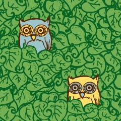

And now, for Contest Watch Extra, the part of the program where we turn to shirt.woot's quarterly doubletake. In all honesty, this quarter contained some of the most unimpressive designs possible to revisit, but there are definitely a few worth keeping an eye on for the upcoming Editor's Choice picks. From the top, we have littleclyde's Sunsplash, a charming piece perfect for the spring/summer transition; Take a Taco for a Walko, by odysseyroc, which is probably just what I don't need (another shirt with a taco on it); Little Leafy Friends by brockart, which is really a sleeper favorite with its smart placement and size; and ncheremnykh's Birdsong, which for all I go on about natural illustration vs. slick vectors, shows the best of that simple and smooth style. I'm not as confident about my picks this quarter as last (nor do I expect to buy any, let alone the 2/4 from last time), but any one of these could print, and would deserve to.


No comments:
Post a Comment