I have slowly but surely started dabbling with Twitter. It still scares me. If you'd like to make it less scary, you can follow me here: http://twitter.com/adderxyu
I'm pretty sure I get more interesting the more eyes are on me.
Friday, March 13, 2009

Thursday, March 12, 2009
Contest Watch: Week of March 5
Welcome, dear friends, to one of the most diverse Contest Watch segments yet. Please watch your step, and come look.
 We start this week at Ink-Hound, somewhere we've talked about but briefly. This is, as I recall, our first time featuring them in Contest Watch, but they've debuted with a killer... Cronikas, by tobefonseca. This is all texture, from the gauzy grid of the (presumably) woman's cloak to the pill-like petals forming the owl's feathers... from the discharge-y fade to the thick spatter. It's all very dramatic in its redscale presentation, yet the characters are mysterious but soothing. It's the sort of thing that unsettles, yet then comforts. Whatever concept is here is only fleeting to me, but the art evokes so much.
 Also new to our roster is ShirtFight, though they have more of an excuse... they only just joined the fray! There's a lot of great stuff up already, though much of it really harps on the "food" aspect of the theme, instead of the bad dreams to come after. We'll see what is to come, but for now, ChrisRisse's "Icecream from Spaaaaace!" is one of my favorites. Forget the fact that astronaut ice cream is a guilty pleasure every kid with just enough of a nerdy streak has long fostered. Forget the fact that the freeze-dried goodness juxtaposed as the space cruiser itself makes for a unique concept. Just look at the colors... the pink pops brilliantly off the black... it's incredibly eye catching. It's also an incredibly fun design, with a definite youthful flair without being decidedly childish (once again, that young lust for freeze dried Neapolitan is coming to the forefront). But I feel the mock-up makes the best point... I love the background. I love how organically it seems to sit on the shirt, and how it doesn't seem boxy, and how the stars and other space debris vary. It helps the main image make even more of an impact, by giving it a habitat instead of just being a big swoosh of an icon. All this makes it my early favorite in ShirtFight's inaugural two-week mega contest.
 Threadless, of course, is not at all new to this site, and there are a few choice choices from them this week. One of the ones I was most drawn to was "What Happened?" by esskayeecee, because it is simply so different. I love the despondent skull reminiscing over his glory days while crippled with uncool in the here and now. I'm also big on the stark yet subtle palette. It's a bit of an in joke, perhaps, and an ironic one at that, since the shirt is a skull shirt lamenting the current perceived tackiness of skull shirts. This isn't the first time I've seen this angle, but the style here is perfectly charming, and the approach is much different than other pieces I've seen, setting it, er, "head and shoulders" above the others. Plus, is that mint? That alone has my vote.
 Continuing the skulduggery is Death's Day Off by Alexmdc. Talking up an Alex piece is sort of like telling God he did an ace job on making trees, but for me, this is beyond even the normal standards. Like the last design, I love the emotion put into the skull. I love what a charming character Death cuts when he's not off deathing. I mean, not that he has much fashion sense, but his get-up of a bowler and Bermuda shorts can't help but evoke a smile. His bike is equally whimsical, complete with bell and basket for his deathpet. But the, er, "killer" here are the more subtle details, whether it be the stink of decay wafting out of his gleeful grin, the flowers dying in his wake, the utterly terrified sun... I especially love the disintegrating butterfly. That's some epic death power right there. And of course, the palette melds the darkness of Hades with the brightness of being free to enjoy yourself, which creates both an interesting and beautiful contrast, both elements remaining at odds with each other, yet integrating very appealingly, and also helps further the concept of the piece. Simply put, I will be shocked if this doesn't print... it's one of the most deserving pieces by one of Threadless's most deserving rising stars.
 We finish this week with an old piece from Design By Humans, ironically from last year's rising Threadless star. I found laserbread's Caspian Tiger (1947) through the inimitable Jimiyo, designer extraordinaire and new DBH artistic director. While he has yet to unexpectedly surrender his TeeFury curating stint to me (jokes, jokes), he HAS been searching for just the right design to kick off his new job. This one is on his shortlist, and I'm glad of it, because I clearly bypassed it on my first go-round. Not that one can -really- blame me... at first blush this was likely just one more tiger, an animal becoming worn out in the tee world despite its beauty. This piece, however, is less about the tiger and more about the execution, which is powerful as hell. It is not the tiger that we should be drawn to, but the erasures below it... the rest of the creature which has been effaced and faded out. It's a unique technique, to have what we wished to get rid of be the point of the piece... what is left of the tiger draws our eyes to what is gone, and it leaves us wondering why anyone would try to destroy what could have been. Once again, I'm glad this came back to my attention.
So that's the story for this week. As always, any of these pieces could help you win a free shirt in our Contest Watch Contest. Only four more updates until the contest closes for entries, so be sure to get your guesses in now! And be sure to join us again next week (and maybe even a few days in between) for more of the best in the world of unprinted tees.
We start this week at Ink-Hound, somewhere we've talked about but briefly. This is, as I recall, our first time featuring them in Contest Watch, but they've debuted with a killer... Cronikas, by tobefonseca. This is all texture, from the gauzy grid of the (presumably) woman's cloak to the pill-like petals forming the owl's feathers... from the discharge-y fade to the thick spatter. It's all very dramatic in its redscale presentation, yet the characters are mysterious but soothing. It's the sort of thing that unsettles, yet then comforts. Whatever concept is here is only fleeting to me, but the art evokes so much.Also new to our roster is ShirtFight, though they have more of an excuse... they only just joined the fray! There's a lot of great stuff up already, though much of it really harps on the "food" aspect of the theme, instead of the bad dreams to come after. We'll see what is to come, but for now, ChrisRisse's "Icecream from Spaaaaace!" is one of my favorites. Forget the fact that astronaut ice cream is a guilty pleasure every kid with just enough of a nerdy streak has long fostered. Forget the fact that the freeze-dried goodness juxtaposed as the space cruiser itself makes for a unique concept. Just look at the colors... the pink pops brilliantly off the black... it's incredibly eye catching. It's also an incredibly fun design, with a definite youthful flair without being decidedly childish (once again, that young lust for freeze dried Neapolitan is coming to the forefront). But I feel the mock-up makes the best point... I love the background. I love how organically it seems to sit on the shirt, and how it doesn't seem boxy, and how the stars and other space debris vary. It helps the main image make even more of an impact, by giving it a habitat instead of just being a big swoosh of an icon. All this makes it my early favorite in ShirtFight's inaugural two-week mega contest.Threadless, of course, is not at all new to this site, and there are a few choice choices from them this week. One of the ones I was most drawn to was "What Happened?" by esskayeecee, because it is simply so different. I love the despondent skull reminiscing over his glory days while crippled with uncool in the here and now. I'm also big on the stark yet subtle palette. It's a bit of an in joke, perhaps, and an ironic one at that, since the shirt is a skull shirt lamenting the current perceived tackiness of skull shirts. This isn't the first time I've seen this angle, but the style here is perfectly charming, and the approach is much different than other pieces I've seen, setting it, er, "head and shoulders" above the others. Plus, is that mint? That alone has my vote.Continuing the skulduggery is Death's Day Off by Alexmdc. Talking up an Alex piece is sort of like telling God he did an ace job on making trees, but for me, this is beyond even the normal standards. Like the last design, I love the emotion put into the skull. I love what a charming character Death cuts when he's not off deathing. I mean, not that he has much fashion sense, but his get-up of a bowler and Bermuda shorts can't help but evoke a smile. His bike is equally whimsical, complete with bell and basket for his deathpet. But the, er, "killer" here are the more subtle details, whether it be the stink of decay wafting out of his gleeful grin, the flowers dying in his wake, the utterly terrified sun... I especially love the disintegrating butterfly. That's some epic death power right there. And of course, the palette melds the darkness of Hades with the brightness of being free to enjoy yourself, which creates both an interesting and beautiful contrast, both elements remaining at odds with each other, yet integrating very appealingly, and also helps further the concept of the piece. Simply put, I will be shocked if this doesn't print... it's one of the most deserving pieces by one of Threadless's most deserving rising stars.We finish this week with an old piece from Design By Humans, ironically from last year's rising Threadless star. I found laserbread's Caspian Tiger (1947) through the inimitable Jimiyo, designer extraordinaire and new DBH artistic director. While he has yet to unexpectedly surrender his TeeFury curating stint to me (jokes, jokes), he HAS been searching for just the right design to kick off his new job. This one is on his shortlist, and I'm glad of it, because I clearly bypassed it on my first go-round. Not that one can -really- blame me... at first blush this was likely just one more tiger, an animal becoming worn out in the tee world despite its beauty. This piece, however, is less about the tiger and more about the execution, which is powerful as hell. It is not the tiger that we should be drawn to, but the erasures below it... the rest of the creature which has been effaced and faded out. It's a unique technique, to have what we wished to get rid of be the point of the piece... what is left of the tiger draws our eyes to what is gone, and it leaves us wondering why anyone would try to destroy what could have been. Once again, I'm glad this came back to my attention.So that's the story for this week. As always, any of these pieces could help you win a free shirt in our Contest Watch Contest. Only four more updates until the contest closes for entries, so be sure to get your guesses in now! And be sure to join us again next week (and maybe even a few days in between) for more of the best in the world of unprinted tees.
Tuesday, March 10, 2009
Fight the Good Fight
Last week, we talked up newbies Teextile's launch. This week, the one-two punch of new blood continues with ShirtFight.
 ShirtFight officially launched Friday, midnight central, but trust me, I'll catch you up. It goes like this: one "fight" a week, one winner a week, $500 and other unannounced silliness/awesomeness. With the launch, however, comes special rules: two whole weeks of submissions and voting, and a $2009 prize. Solid stuff for a startup, and definitely worth popping in to check them out if you're a designer. This week's theme: "eating junk food before bed." Basically it's all about weird dreams and the like... you've still got plenty of time to try your luck. We recommend you do it.
Unlike our the other start-up we've been keeping our eyes on, ShirtFight launched with a pair of tees ripe for the purchase at an introductory price of $15, presumably the debut price for all their shirts. Free shipping, no less, so you can't sniff at that. And what does a SF design look like? Well, it probably looks like herky's Zombie Lunch, my fav. of the two currently for sale. It has a total "Big Daddy" Roth feel to me, given the overblown cartoon grotesqueries of the artwork, while the halftones make it seem almost comic-book up close. The colors scream at your eyes, but work together ideally. And the concept, while treading basic zombie ground, has a definite humor to it (and I think the brain pie is absolutely delicious... well, design-wise). If this is ShirtFight's MO, it certainly will do much to set it apart from other contest sites, and while I don't know that I'd want a whole catalog like this, it makes me both intrigued and excited to see where the site evolves once the fights really get into full swing... I simply don't think other shirt contests are thinking like ShirtFight is, and that makes me feel they didn't just buy those gloves for the product photos... they're in this fight to do some damage
ShirtFight officially launched Friday, midnight central, but trust me, I'll catch you up. It goes like this: one "fight" a week, one winner a week, $500 and other unannounced silliness/awesomeness. With the launch, however, comes special rules: two whole weeks of submissions and voting, and a $2009 prize. Solid stuff for a startup, and definitely worth popping in to check them out if you're a designer. This week's theme: "eating junk food before bed." Basically it's all about weird dreams and the like... you've still got plenty of time to try your luck. We recommend you do it.Unlike our the other start-up we've been keeping our eyes on, ShirtFight launched with a pair of tees ripe for the purchase at an introductory price of $15, presumably the debut price for all their shirts. Free shipping, no less, so you can't sniff at that. And what does a SF design look like? Well, it probably looks like herky's Zombie Lunch, my fav. of the two currently for sale. It has a total "Big Daddy" Roth feel to me, given the overblown cartoon grotesqueries of the artwork, while the halftones make it seem almost comic-book up close. The colors scream at your eyes, but work together ideally. And the concept, while treading basic zombie ground, has a definite humor to it (and I think the brain pie is absolutely delicious... well, design-wise). If this is ShirtFight's MO, it certainly will do much to set it apart from other contest sites, and while I don't know that I'd want a whole catalog like this, it makes me both intrigued and excited to see where the site evolves once the fights really get into full swing... I simply don't think other shirt contests are thinking like ShirtFight is, and that makes me feel they didn't just buy those gloves for the product photos... they're in this fight to do some damage
Monday, March 9, 2009
Update: A Million Little Peoples
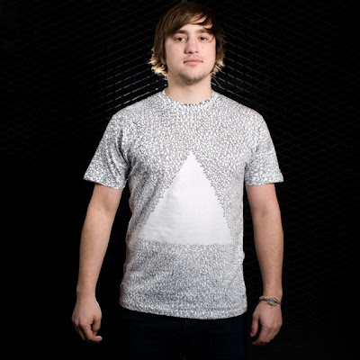 Holy old-school, Batman! Threadless has been snagging a lot of two-month-old designs lately for their winners' circle, but they went aaaaall the way back to September this week to pull out MINNIM's "The Infinite Struggle." What a left-field choice, we say... though we're certainly not going to complain, since the print brings our update tally up to 20. As we predicted in our second Contest Watch ever, from afar it looks like a textured shirt with a big triangle on it, though while we posited that it would be less than interesting at that distance, in reality, it looks pretty good anyway, and is definitely distinctive. Up close, the detail seems to be preserved, and I'm still of the belief that this will be the sort of shirt that could be worth buying just to look at it... especially since THE BACK IS PRINTED TOO! Yes, this is the epic doodle to end all doodles. I wish Threadless would have posted a full view of the back on this one, so we could get a feel for what to expect. Still, it's a unique piece that is going to be especially striking with spring around the corner, letting you flaunt every inch of hand-cramping detail. Seriously, pick one up if only to support the bills MINNIM surely has incurred for carpal tunnel. And don't forget, every update creeps us closer to the end of our Contest Watch Contest. In case you didn't know, you can win a freaking FREE SHIRT. We don't know why you haven't entered yet, but let this shirt be a reminder... literally every shirt is in the running. Good luck on those guesses!
Finally, it's Bestee of the Month time again. My vote is an admitted long-shot to AndyG's Capistrano Spring Break. If you like it, and want to keep the fight interesting, vote vote vote!
Saturday, March 7, 2009
Vote Bad As Hell!
We here at SingulariTee have taken a shine to a small time indie brand, Bad As Hell Clothing. You've perhaps noticed us write them up a few times already. At the moment, they are competing in a "brand battle" at Always Urban. If you're interested, toss them a vote... they've done some great work already, and more exposure can only improve their bottom line, their payouts, and most importantly for a growing company, their talent pool.

AlwaysUrban.com
AlwaysUrban.com
Thursday, March 5, 2009
Contest Watch: Week of February 26
Words can't express how uninspired I am today... hence the putting this off and putting this off... but we bloggers have obligations, eh? Thankfully, there was plenty of artistic inspiration to go off.
 I'm going to start at Design By Humans today, to prove a bit of a point. See, I'm often harsh on branding. It takes the focus off what we should be focusing on: great design. Too many brands are more focused on their brand than making something wearable outside of promotional applications. Others take great work, and ruin it by adding in that unrelated brand tag. It's the downfall of many smaller sites, and it's one of many reasons I've never loved DBH's special contests... the few truly artistic pieces seem to get lost in the milieu of generic logos, and even then, it's still a brand I don't feel strongly enough to support on my chest.
All that said, I HAD to write up Wotto's "Quicksilvery" because I would wear it right now, trite surf/skate shop branding and all. What I love about this is twofold. Firstly, it totally encapsulates the brand as I understand it... there's plenty of boarding going on in various settings, of course, and both their logo and icon are incorporated. Even the shirt itself rides the "silver" wave. The great thing here, though, is that their logo is subtle and secondary, while their icon is used creatively and organically, making this a shirt more than a marketing tool. Secondly, though, is how completely Wotto it is... the characters are quirky and seriously awesome, and there are great details and textures. The flow is solid, with elements playing with each other and against each other... I really like how the waves reach out to the skate-park area, and rise against the mountains, for example. And those mountains... hell, they are charming enough to make the whole tee. I'd call them the definite focal point. Even so, I am mixed on this design for one reason. It needs to place... if it doesn't, then these branded contests are little more than a joke... a way to bring in top contest designers just to make a generic branded tee. This not succeeding would fly in the face of everything DBH seems to stand for artistically... the special contests so often feel like they come at the expense of the regular contest entries, and that'd be even more so if the winners were all nothing special. But the part where I'm torn is, if it doesn't place, might I be able to get this without the branding? Either way, a great piece. Congrats, Wotto, for scoring what I believe is thusfar the longest rant in Contest Watch history.
 Of course, if your lust for weird critters simply can't be sated by Wotto alone, you probably need a good dose of Aphte, likely my favorite in that department. This week at Threadless, he's been on a roll, submitting a number of simple two-color combo pieces. All are charming, but my favorite is Blue and Yellow. While its win on color combo is far from definitive (all the pairings are pleasing to my eyes while feeling a bit quirky and unconventional), it's far and away my favorite on characters and layout, and ergo the one I'd most love to see print. It might be all a matter of that central character, with his knobby elbows, apparent dress of sorts, and what appears to be a monster-hat and beer bong... he serves well in anchoring all the other delicious oddness. Still, all the combos are worth checking out. They all make excellent use of that third color (the black outline, which helps make everything pop), and each one is featured with two killer shirt color options. While I prefer the starkness of the white tee in almost every case, the more vibrant options always make for a whole new experience. A great series, and this one is the best of the lot in my eyes.
 There's not a lot to say about Childmirror's "Change, Change, Change," but I'll go through the basics. Firstly, it is part of "rabbit week." I'm pretty sure this is a celebration only CM knew about, but it was a charming one nevertheless, and one worth browsing his other work to see more from. Secondly, it's a chest placement, if you need to know such things. And thirdly, it's awesome. I love the textures, but mostly I love the evolution from leaper to leaper. A totally lovely idea that really speaks for itself.
 I am a great lover of absurdity in tees. Why, just this afternoon I was discussing how to me, if a concept doesn't make sense as to "why," it had better go whole hog on either the art or the absurdity. Timrb's "Historical Mnemonic" takes the latter approach. I like the vintage approach to the style, and I like the simple palette. But what I love, and what makes this so vital to my wardrobe, is how ludicrous it is as a concept. Even if it didn't play off the classic Columbus mnemonic, the idea of sailing to the moon in an old galleon is a quirky and romantic notion, and the art captures that. But with the matter-of-fact message in the filigree, it really turns the piece on its head as regards what sort of art it is. None of the pieces fit... Lincoln was long dead before space travel, and hundreds of years in the making in 1492. There's no reason for me to believe he was ever a sailor... I couldn't even say for sure if he was ever on a ship. I clearly slept through that part of history class (if only I'd dreamed this shirt while I was at it). And of course, boats don't sail to the moon. But while it may look like I'm playing Captain Obvious, it is those obvious points which make the combination of elements in the joke so effective. Effective enough to garner a real laugh out of me. Humor is so often about choosing your words, and this piece handled that masterfully. That it's got some solid art and looks like it'll sit well on a shirt are simply added perks.
 Finally, we end with shirt.woot, ever-fickle contest that it is. Grayehound is to blame for this one, and I for one would be proud of such blame were I him. An Island Unto Herself (Redux) stands as one of the most impressive derby entries I've ever seen. I love the care put into this... even the rough-drawn silhouette gives an impression of coming out of a rocky inlet to see the scene captured here. The other winning aspects should be more obvious... the color interplay, the sailboat making a perfect, subtle eye, while the cascading flowers set into their vines seem natural masquerading as hair... the thing that really blows me away, though, is the water rendering. It really looks spot-on and gorgeous... a total paradise. The whole piece is a mess of details that simply had to have taken serious time to perfect to this level... all that and a definable, appealing concept. It's totally refreshing to see an artist take that sort of time with any piece, but especially for woot work.
I'm pretty excited for next week... with a couple new faces in the game, it should be exciting. We'll see you then, as always... hopefully a shred earlier.
I'm going to start at Design By Humans today, to prove a bit of a point. See, I'm often harsh on branding. It takes the focus off what we should be focusing on: great design. Too many brands are more focused on their brand than making something wearable outside of promotional applications. Others take great work, and ruin it by adding in that unrelated brand tag. It's the downfall of many smaller sites, and it's one of many reasons I've never loved DBH's special contests... the few truly artistic pieces seem to get lost in the milieu of generic logos, and even then, it's still a brand I don't feel strongly enough to support on my chest.All that said, I HAD to write up Wotto's "Quicksilvery" because I would wear it right now, trite surf/skate shop branding and all. What I love about this is twofold. Firstly, it totally encapsulates the brand as I understand it... there's plenty of boarding going on in various settings, of course, and both their logo and icon are incorporated. Even the shirt itself rides the "silver" wave. The great thing here, though, is that their logo is subtle and secondary, while their icon is used creatively and organically, making this a shirt more than a marketing tool. Secondly, though, is how completely Wotto it is... the characters are quirky and seriously awesome, and there are great details and textures. The flow is solid, with elements playing with each other and against each other... I really like how the waves reach out to the skate-park area, and rise against the mountains, for example. And those mountains... hell, they are charming enough to make the whole tee. I'd call them the definite focal point. Even so, I am mixed on this design for one reason. It needs to place... if it doesn't, then these branded contests are little more than a joke... a way to bring in top contest designers just to make a generic branded tee. This not succeeding would fly in the face of everything DBH seems to stand for artistically... the special contests so often feel like they come at the expense of the regular contest entries, and that'd be even more so if the winners were all nothing special. But the part where I'm torn is, if it doesn't place, might I be able to get this without the branding? Either way, a great piece. Congrats, Wotto, for scoring what I believe is thusfar the longest rant in Contest Watch history.
Of course, if your lust for weird critters simply can't be sated by Wotto alone, you probably need a good dose of Aphte, likely my favorite in that department. This week at Threadless, he's been on a roll, submitting a number of simple two-color combo pieces. All are charming, but my favorite is Blue and Yellow. While its win on color combo is far from definitive (all the pairings are pleasing to my eyes while feeling a bit quirky and unconventional), it's far and away my favorite on characters and layout, and ergo the one I'd most love to see print. It might be all a matter of that central character, with his knobby elbows, apparent dress of sorts, and what appears to be a monster-hat and beer bong... he serves well in anchoring all the other delicious oddness. Still, all the combos are worth checking out. They all make excellent use of that third color (the black outline, which helps make everything pop), and each one is featured with two killer shirt color options. While I prefer the starkness of the white tee in almost every case, the more vibrant options always make for a whole new experience. A great series, and this one is the best of the lot in my eyes.There's not a lot to say about Childmirror's "Change, Change, Change," but I'll go through the basics. Firstly, it is part of "rabbit week." I'm pretty sure this is a celebration only CM knew about, but it was a charming one nevertheless, and one worth browsing his other work to see more from. Secondly, it's a chest placement, if you need to know such things. And thirdly, it's awesome. I love the textures, but mostly I love the evolution from leaper to leaper. A totally lovely idea that really speaks for itself.I am a great lover of absurdity in tees. Why, just this afternoon I was discussing how to me, if a concept doesn't make sense as to "why," it had better go whole hog on either the art or the absurdity. Timrb's "Historical Mnemonic" takes the latter approach. I like the vintage approach to the style, and I like the simple palette. But what I love, and what makes this so vital to my wardrobe, is how ludicrous it is as a concept. Even if it didn't play off the classic Columbus mnemonic, the idea of sailing to the moon in an old galleon is a quirky and romantic notion, and the art captures that. But with the matter-of-fact message in the filigree, it really turns the piece on its head as regards what sort of art it is. None of the pieces fit... Lincoln was long dead before space travel, and hundreds of years in the making in 1492. There's no reason for me to believe he was ever a sailor... I couldn't even say for sure if he was ever on a ship. I clearly slept through that part of history class (if only I'd dreamed this shirt while I was at it). And of course, boats don't sail to the moon. But while it may look like I'm playing Captain Obvious, it is those obvious points which make the combination of elements in the joke so effective. Effective enough to garner a real laugh out of me. Humor is so often about choosing your words, and this piece handled that masterfully. That it's got some solid art and looks like it'll sit well on a shirt are simply added perks.Finally, we end with shirt.woot, ever-fickle contest that it is. Grayehound is to blame for this one, and I for one would be proud of such blame were I him. An Island Unto Herself (Redux) stands as one of the most impressive derby entries I've ever seen. I love the care put into this... even the rough-drawn silhouette gives an impression of coming out of a rocky inlet to see the scene captured here. The other winning aspects should be more obvious... the color interplay, the sailboat making a perfect, subtle eye, while the cascading flowers set into their vines seem natural masquerading as hair... the thing that really blows me away, though, is the water rendering. It really looks spot-on and gorgeous... a total paradise. The whole piece is a mess of details that simply had to have taken serious time to perfect to this level... all that and a definable, appealing concept. It's totally refreshing to see an artist take that sort of time with any piece, but especially for woot work.I'm pretty excited for next week... with a couple new faces in the game, it should be exciting. We'll see you then, as always... hopefully a shred earlier.
I WANT TO DANCE TOO: MOVED TO TODAY!!!
 Sorry for the late reminder/update! Teextile switched it up on us last minute, printing RecycledWax's "I Want To Dance Too" today instead of tomorrow as scheduled. If you loved this, grab it now now now... it's gone at midnight. Sorry I couldn't alert y'all earlier... I'd just now checked the site, presuming I knew what was printing. I hope no one misses out, and hope for Teextile's sake that these sort of mix-ups are kept to a minimum.
Wednesday, March 4, 2009
$10 SerendipiTees at DBH
If you run a shirt blog, you probably need to love tee puns as much as you love tees themselves. Which is one of many reasons we were absolutely chuffed when Design By Humans rolled out their latest awesome promotion. Ladies and Gentlemen, the Serendipitee!
 Of course, I'm a sucker for grab bags like this, but there are reasons you should be too. DBH is far from the true high end of internet tee retail, but a $10 shirt is still about 50-60% cheaper than they normally run. If there are many you're interested in, it's already likely paid for itself. These ain't just the dregs, either... while it's possible that you'll get something languishing in only a couple unsold sizes, and INFINITELY more likely you'll find yourself outfitted in designs printed on tee blanks other than their new "perfect" tees, DBH promises that every tee in print is up for grabs. I wouldn't get my hopes up for something very new, but the potential is there, so say they.
The reason this is way more worthwhile than some grab bags, though, is the sheer content you'll score. DBH has some of the boldest and most innovative shirts on the market. They use foils, embroideries, huge prints, specialty inks of all sorts, discharge prints... the fact is, you're probably going to get a tee that pushes the envelope for the price of a deal-a-day site. It's like getting a gourmet meal for the price of the Olive Garden... and while you might prefer simplicity, THIS is the sort of time to try something new. You could find that you actually love artistic threads or big prints. You might get a shirt that you'd have never wanted at $25, but swoon over for $10. And if you really, really hate it, there's always the amazing TeeTrade.
No clue how long this promo is gonna go on for... could be forever, could be 'til the weekend... so it's probably most prudent to snap some up ASAP. I wish you luck in finding something epically awesome. But with DBH's catalog, that shouldn't be too hard. And if you're still unconvinced, use code CRDJGN for 10% off any DBH purchase til March 17th... that includes your Serendipitees.
Of course, I'm a sucker for grab bags like this, but there are reasons you should be too. DBH is far from the true high end of internet tee retail, but a $10 shirt is still about 50-60% cheaper than they normally run. If there are many you're interested in, it's already likely paid for itself. These ain't just the dregs, either... while it's possible that you'll get something languishing in only a couple unsold sizes, and INFINITELY more likely you'll find yourself outfitted in designs printed on tee blanks other than their new "perfect" tees, DBH promises that every tee in print is up for grabs. I wouldn't get my hopes up for something very new, but the potential is there, so say they.The reason this is way more worthwhile than some grab bags, though, is the sheer content you'll score. DBH has some of the boldest and most innovative shirts on the market. They use foils, embroideries, huge prints, specialty inks of all sorts, discharge prints... the fact is, you're probably going to get a tee that pushes the envelope for the price of a deal-a-day site. It's like getting a gourmet meal for the price of the Olive Garden... and while you might prefer simplicity, THIS is the sort of time to try something new. You could find that you actually love artistic threads or big prints. You might get a shirt that you'd have never wanted at $25, but swoon over for $10. And if you really, really hate it, there's always the amazing TeeTrade.
No clue how long this promo is gonna go on for... could be forever, could be 'til the weekend... so it's probably most prudent to snap some up ASAP. I wish you luck in finding something epically awesome. But with DBH's catalog, that shouldn't be too hard. And if you're still unconvinced, use code CRDJGN for 10% off any DBH purchase til March 17th... that includes your Serendipitees.
Tuesday, March 3, 2009
Read About it in a Blog, Read About it With a Frog
So there's this awesome site called Cameesa that I know I've told y'all about before, but is too awesome not to keep mentioning. It's all about crowdfunding... you the customer can control what prints by helping fund it. It's a great opportunity for shirts with rabid fanbases but just not enough mainstream support to succeed on voting sites. Here at Singularitee, we of course have favorites: currently we're throwing our $20 behind Coq Music, Color Bleeding, and Space Bees II. Check 'em out and support 'em if you dig 'em.
 But this isn't about that as such: it's about a promo the site is running in honor of Dr. Seuss's birthday. Yes, we know that the good doc isn't able to celebrate with us, but his work has stoked the imaginations of millions for generations. In his honor, and in conjunction with their two excellent bookish tees, they're holding a contest. Grand prize is one of those two literatees and a book of your choice. This is an awesome prize, and I am greedy, but sometimes obligations come first... it's definitely worth checking out. Hell, feel free to wax nostalgic on books here too... I'd love to hear all about it.
Of course, if you don't win, or don't trust your chances enough to enter, you could always just pick up their literary threads individually. One has been praised often at this blog, but the second is one of their longest running tees, and the shirt that made me start expecting big things from the site: Take Me To Your Reader, by vonmonkey. I like the mixed feel of it... the simple outline of a cityscape as compared to the designer's trademark sketchy, detailed style on the otherworldly tome and the unsuspecting man about to be abducted, and that combined with the wall of text that makes up the beam encompassing the character. The vintage looking text works well with the vintage looking illo, and the color scheme only serves to hammer home the concept. But the concept is solid on its own, as well. I love this because it seems like a classic commentary on the imagination... the way good literature can feel like it's taking you away to another world. That the shirt features elements that could have been a great short story in and of themselves shows that this is a concept the designer was really feeling upon creating it, and one that will lead potential fans to fall in love with the piece as much as it is presumed the designer did with its concept.
But this isn't about that as such: it's about a promo the site is running in honor of Dr. Seuss's birthday. Yes, we know that the good doc isn't able to celebrate with us, but his work has stoked the imaginations of millions for generations. In his honor, and in conjunction with their two excellent bookish tees, they're holding a contest. Grand prize is one of those two literatees and a book of your choice. This is an awesome prize, and I am greedy, but sometimes obligations come first... it's definitely worth checking out. Hell, feel free to wax nostalgic on books here too... I'd love to hear all about it.Of course, if you don't win, or don't trust your chances enough to enter, you could always just pick up their literary threads individually. One has been praised often at this blog, but the second is one of their longest running tees, and the shirt that made me start expecting big things from the site: Take Me To Your Reader, by vonmonkey. I like the mixed feel of it... the simple outline of a cityscape as compared to the designer's trademark sketchy, detailed style on the otherworldly tome and the unsuspecting man about to be abducted, and that combined with the wall of text that makes up the beam encompassing the character. The vintage looking text works well with the vintage looking illo, and the color scheme only serves to hammer home the concept. But the concept is solid on its own, as well. I love this because it seems like a classic commentary on the imagination... the way good literature can feel like it's taking you away to another world. That the shirt features elements that could have been a great short story in and of themselves shows that this is a concept the designer was really feeling upon creating it, and one that will lead potential fans to fall in love with the piece as much as it is presumed the designer did with its concept.
Monday, March 2, 2009
Happy Birthmonth: Teextile is born!
Big Exciting Stuff this month, as it should be. March is a lot of things: my birth-month, for one. This year, though, I'm sharing the month with two exciting new Tee competitions. I have some personal features planned, and hopefully some themed content, but most importantly we want to get the new blood up and running with some promotion. For you designer types, it's worth checking them out and hitting up their respective FAQs.
Teextile is the first to start up, having released its first shirt today at midnight (Eastern Standard Time, for you checkers). They're kind enough to provide us a ticker so we can figure out print time for our own personal locations... stand-up blokes, them. Their first shirt is one I'm mixed on... Good Old Times by Fatmouse. The pros: it shows off their size capabilities, for starters, and it makes a very wearable brand tee... the pixelized feel and old-school gaming homage isn't something I'm gonna rush out and buy, but it would certainly be something that could find an audience willing to wear it. The coolest part is the color-selection: you could feasibly have Teextile print the one-color piece in any shade you preferred, making it totally custom. My biggest question mark, though, is this: I'm unsure who wants to sport a brand they don't even know if they love yet. Thankfully for Teextile, there seems to be plenty of reason for those few to want to keep on wearing it... I just feel it's going to be a slight financial disappointment, and a larger disappointment to future fans who will wish they'd taken that leap of faith.
 Thankfully for the sales of shirt #1, Teextile has also released their entire week's lineup, and the lineup seems way strong enough for the brand to gain immediate fans. I think this is an excellent idea for the new company... instead of relying on people to check every day, it gives artists enough time to promote their upcoming shirt, fans the ability to plan to budget in their favorites, and the uninitiated will get to preview what's coming up and get excited, instead of perhaps missing out on a shirt for want of checking daily... seriously, who can remember all those crazy daily sites? I'm guessing we'll be seeing these previews post every weekend, as Teextile doesn't plan to sell anything those days.
What I'm most excited for is RecycledWax's "I Want To Dance Too," a longtime Contest Watch favorite and officially update #19. It will be printing Friday, giving you plenty of time to plan to snag one. And you really should. While I still hold true that I'm not entirely in love with the shot-glass son here, I do love the overall liquid feel of the colors and the blissful romance of the main characters. The kid dampens the romance, as they always do, but it's still a totally worthwhile purchase. Don't forget, $15 on Friday, because even if you win over at our big CW contest, it's rather unlikely I'll be able to snag one of these as a prize for ya... one day and all that.
Teextile is the first to start up, having released its first shirt today at midnight (Eastern Standard Time, for you checkers). They're kind enough to provide us a ticker so we can figure out print time for our own personal locations... stand-up blokes, them. Their first shirt is one I'm mixed on... Good Old Times by Fatmouse. The pros: it shows off their size capabilities, for starters, and it makes a very wearable brand tee... the pixelized feel and old-school gaming homage isn't something I'm gonna rush out and buy, but it would certainly be something that could find an audience willing to wear it. The coolest part is the color-selection: you could feasibly have Teextile print the one-color piece in any shade you preferred, making it totally custom. My biggest question mark, though, is this: I'm unsure who wants to sport a brand they don't even know if they love yet. Thankfully for Teextile, there seems to be plenty of reason for those few to want to keep on wearing it... I just feel it's going to be a slight financial disappointment, and a larger disappointment to future fans who will wish they'd taken that leap of faith.
Thankfully for the sales of shirt #1, Teextile has also released their entire week's lineup, and the lineup seems way strong enough for the brand to gain immediate fans. I think this is an excellent idea for the new company... instead of relying on people to check every day, it gives artists enough time to promote their upcoming shirt, fans the ability to plan to budget in their favorites, and the uninitiated will get to preview what's coming up and get excited, instead of perhaps missing out on a shirt for want of checking daily... seriously, who can remember all those crazy daily sites? I'm guessing we'll be seeing these previews post every weekend, as Teextile doesn't plan to sell anything those days.What I'm most excited for is RecycledWax's "I Want To Dance Too," a longtime Contest Watch favorite and officially update #19. It will be printing Friday, giving you plenty of time to plan to snag one. And you really should. While I still hold true that I'm not entirely in love with the shot-glass son here, I do love the overall liquid feel of the colors and the blissful romance of the main characters. The kid dampens the romance, as they always do, but it's still a totally worthwhile purchase. Don't forget, $15 on Friday, because even if you win over at our big CW contest, it's rather unlikely I'll be able to snag one of these as a prize for ya... one day and all that.
Subscribe to:
Posts (Atom)

 Posts
Posts


