We're back again with some contesty goodness. Before we continue on, I'd like to ask for a couple favors. For starters,
The Fish Van, by RandyOtter, is up for voting at Tilteed. We love this piece (it was a former CW highlight), this designer (see this entry for more details), and the site it's at (big ol' Duh there), so don't hesitate to give it some love. But I also have a personal request for you in the form of my old piece "
You Can Dance If You Want To". I don't have a whole bunch of designs I'm totally happy with, but this is certainly one of them, and I'm trying it over at Inkblitz. If you like it, give it some love. I could use the help. Thank you for letting me beg. You know I don't do it for myself often. As always, you can support current Adder projects in our sidebar. But you don't want my promotion. You want the goods. And goods you shall get.

We start this week at
shirt.woot, with a somewhat infuriating piece from geekfactor12. Now, I know what you're thinking: why would I talk about an infuriating piece, and first no less? Well, Impatient Dan, this is why. I love
Rock and Roll, as a genre and a shirt. That's not frustrating at all. To be honest, this design in and of itself made me not hate woot's fake vintage derby as soon as I saw it. It really hammered home the theme in all the best ways... the colors feel totally vintage in their soft, faint shades and retro combination. The brief slogan makes it look like you could find it anywhere. But the frustrating thing is that it is a videogame reference, and one I'm not really qualified to wear. Miss MJ has done this to me twice now: I bought her woot classic "The Cake is a Liar" without even knowing Portal, because it was so well done as a joke tee that it was something even a non-gamer could appreciate. I don't know if I could buy a second shirt from a game I've never played. I'm already scared of meeting gamers on the street with my few related tees, though this is likely unfounded since most gamers I know don't go outside. So if this went on sale, I'd be conflicted. But it's a conflict I think I want to have. The tee is too smartly executed for anyone to be able to wear with confidence for it not to exist.

The rest of the week belongs to
Threadless, starting with a woot piece from early this year.
Breath of Life is just one of many pieces theinfinityloop has been reworking and resubbing from her lengthy back-catalog of unprinted designs, but it's also one of the better ones. She really revamped this one, too, from it's original state. The finished product is far crisper than before, which serves the entire piece well, since the color scheme demands crispness. The one-color aspect really doesn't harm this at all, though. We still have plenty of motion in the waves, shine in the horn, expression in the moon... everything just looks wonderful. The illustration is even a bit magical: the moon is always a bit haunting to me, and seeing it in a life-giving mode is interesting. The piece plays on the tides, and the necessity of water to life, but it also considers that a lunar hand in the process of vitality would make things a bit different. Moonlight is in contrast to the darkness that surrounds us when it reflects back at us, and similarly the moon here blows life into its subjects, but does it juxtaposed with the darkness of its being. The creatures are being re-fleshed from their skeletal structure, giving a creepy feel more suited to the moon itself. I personally love that choice... it adds a lot of visual intrigue, even though for me, it's still the moon and its horn that I focus in on. I also love how this sits on the shirt. It's all around a creative and unique piece, and I hope to get to rock this on my chest sooner than later.

Switching gears to something much more sunny, we have the aforementioned Randyotter3000, bringing us "
Rise and Shine". This is a total Threadless tee, to me... simple style and colors, a little out there, but endlessly charming. I love the big lazy mountain (I relate possibly a little too well), slouched over so long trees have grown on him, while the sun warms him and shines morning down, and the cloud blows wind, or snow, or rain. It's almost like they're getting him showered and ready for a long day of sitting around being imposing. The thing I like best here is how damn happy the elements are, eager to help their mountain friend get ready for the day ahead, compared to how completely uninterested, exhausted, lazy, disgusted, etc the mountain seems. He's not having any part of it. Most people
shouldn't mess with mountains, but the scene here is all the more amusing and fun with them spewing forth their joy. I'm shocked RO3K doesn't seem to have like 20 prints in the pipeline at T-less, but this one would definitely have a chance of changing that.

One thing that really struck me this week was joaolauro's "
Deadly River Sneaking Along." It's certainly not only because it appears inspired by Heart of Darkness (In the description, the artist includes the quote: "And the river was there - fascinating - deadly - like a snake.") though certainly I appreciate that people are still able to gain inspiration like this from literature. While I'm also all for a good snake tee (gotta represent the fellow snakeys, I suppose) that's only a smidge of it also. The real winning element here is the texture. The texture that makes the snake snakey and the water watery. The texture that makes the trees and landscape look weathered and barren. The texture that keeps the scene looking ominous while also feeling vintage and classic, like an old print. The texture that adds impressive depth to very few colors. I also love this blue. It's a perfect shade (I do believe my likelihood of liking a tee increases exponentially when it contains this blue). And really, by now we should all know that I'm into any design with a good degree of oddity in it... the morph of the snake is a lovely feature of this, but the canoeing deer makes it almost impossible to pass over. It hits all the right notes for a great, unique, distinctive shirt, especially if you happen to be me. And if you can't be that lucky, you should be hoping doubly for this shirt to print, because it could be the next best thing.

Finally, amarillo wants a few things. Mainly, I imagine he wants a Threadless shield. The multitude of prints the man has had throughout the tee world stops short at the reason internet graphic tee shops became so popular. Which seems like a travesty. He also wants to tell us "
fuck you, I'm an anteater." Which is pretty powerful language from an anteater.
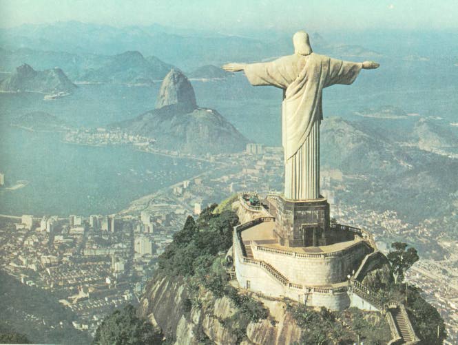
(M)Anteater is the logical intersection of these desires. Nothing gives an "up yours" attitude like being taller than a building and eating humans. Take that, guys! All this fits in well with amarillo's normal style, though. The buildings are an easy reference point (and I love how they're sort of bending away from the giant Antzilla going all
Cristo Redentor on this city), as is the texturing on the anteater itself. And as is often the case when a piece like this makes it into our round-up, it may be ostensibly linked to a memetic reference, but the level of extra concept and detail and style added make this far more than that. It's far more a tribute to classic monsters, and the odd elements all but force it to feel unique anyway. It could be just the right combo to secure amarillo his rightful shield, but more importantly, it's a fun, crazy piece that lives up to both his style and his reference.


No comments:
Post a Comment