 Let's start at Uneetee this week, where Radiomode has given us One Flight Down of the All Seeing Eye. It's a reworking of a piece he did for DBH's Quiksilver contest, and that it didn't win speaks volumes about how odd the selections for that contest were. To sum the design up in a word, "bold" comes to mind... it's a big print with a very visually dominant placement. The over-the-shoulder print makes the massive bird feel as though it truly is swooping down, and its head rests right at the chest, where ones eye is most easily drawn. You can't ignore the print. As for his amulet, also resting in that key visual area, the splashes of faint color help it look like it is indeed shining, and brings your eye to the eye upon it. One more proof that great shirt art turns a shirt into more.
 Threadless, of course, makes its own bold statements, with its regular dose of humor. Take pilihp's Arr, Let O' Me Nuts. It's probably one of my favorite "mixed" designs... no "nuts" joke intended. It's totally relatable, inasmuch as we've all done idle doodling on ads, news clippings, and the like. Seeing the clean, cartoony vectors adorning the photographed squirrels has that same quasi-vandal humor, made stronger by both the sheer concentrated effort to make them into pirates, and the adorable ridiculousness of that final image. The added accessories really do fit smartly on the images of the rodents, skillfully tailored by the designer. I also really like their transparency... not only does it hammer home the add-on quality, but it gives them an almost imagined feel, as though the squirrels are fancying themselves as swashbucklers, which I have to admit is pretty hilarious. In a way, squirrels are pirate-like... always stealing booty and hiding it away as though making their own treasure maps. I think it'd be great if they could actually picture themselves that way, as well.
 If your jokes need to be punchier, though, I cannot say enough good things about Pictograms Can be Tricky. This rodrigobhz tee has a killer uppercut of a punchline using some smart parody. It's put together with a smart cartoon style that really gets the joke across and makes the graphic attractive enough to be wearable. What really makes a joke like this a winner, though, is how creative it is... it's easy to be funny, or even be unexpectedly funny, but to pull out a joke that is so unexpected that you know you'd never have thought of it, but so perfect that you'll never be able to unthink it, takes a certain flash of brilliance. And this has it.
 More subtly, though, we've got something as well. But where the last few pieces were all about bold humor, big laughs, and getting attention, Swan Tangle's humor is a smile, not a guffaw. Which is perfectly fine, because the biggest bit of charm in Aquarium's tee is not the humor. Sure, the pigpile of birds, all for one little fish, has its own humor, but there's way more to it for me. It's about the visual intrigue of those twisting necks, entwining over and around and under even more dramatically than they can in real life. It's about the skilled rendering of the swans... there's great detail and shading in making them what they are on the shirt. It's about the shape they make, which is just wonderful. For me, though, one of the greatest things about this is the color scheme. I think swans have a pretty damn great color scheme in and of themselves, but that pure white, not to mention the bold orange of their bills and the fish, really looks stunning against the deep royal blue. There's just enough concept to add a flourish to the art, but the artistic choices are what really make this a flawless tee (and the second gorgeous swan tee I'll be buying from Threadless, at that).
 Finally, to Design By Humans, which ends similarly to how we opened. Rho Fiera/Black Diamond is almost the opposite of Radiomode's tee, insofar as the left shoulder is the only part of it that ISN'T a print. I'd imagine the design's massive white space would end up being a discharge print if it made it to print. Anyway, speculation aside, Ibis's ode to geometry (and possibly playing cards) is another bold one. The bulk of the design, an infrastructure of rods and points forming diamonds and triangles, is on the chest, which is classically the least creative place to stick a tee graphic, but the way it inhabits the shirt is what makes it so good... it feels like the red is encrouching on the white, flowing in via that infrastructure and taking over. It's interesting that the rigid geometry can create an organic flow, but that's what it seems to do. The black diamonds are great, as well, because they break up the repetition with a bold contrast. Not to mention, as a friend of mine said the last time I mentioned something with a similar color scheme, I "really will wear anything with black white and red, won't you." Not anything. But oh god is it close. Because this right here I would buy... it simply looks that good.
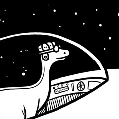
So what makes this a plus? As I said, frequent readers would know the most likely excuse: another shirt.woot Doubletake Derby. This round, we at SingulariTee beg beg beg woot to consider their Editors Choices carefully, as the voting round seemed to be considered in any way but carefully. Yeah, if you're not hip to the woot, next week's daily selections will all be former derby entries chosen by woot staff, not woot voters. Which means they have the chance to finally not get it wrong. Now, woot's a tough egg to crack when it comes to what they'll print for ECs, and I have my gut feelings, but taking into account what I think they might print vs. what I'd like to see printed, I'm going to postulate the following: the lush, summery greens and skillful lines of Drakxxx's Wise Old Master; the smart and funny personification of rglee129's Technophilia; the brilliant quirkiness of EdgarRMcHerly's Oh S-Word! It's Atlas; and the stark, bold black and white of Dekonstruct's Brontosnorus Saves the World. As per usual, the roundup will come some time after next week's Contest Watch.


1 comment:
*blushes*
Thank you so much, man!
:)
rodrigobhz
Post a Comment