...

Tuesday, September 29, 2009

Of Course, Of Course

Despite compelling evidence to the contrary in my younger days, I've never really seen the appeal of horses. I mean, sure, they're cool animals, but the allure that many seem to fall prey to is lost on me. I must presume that this is because I have never seen creepy cactus horses, though, because Mitohapa's "The Ghost Town Cactus Trio" is pure awesome.

It's been picked up by the wonderful folks at Tilteed, who have just recently switched to a weekly format instead of their previous schedule of once every three days. While this may mean fewer shirts in total, here at the blog there's a definite feeling that Tilteed is doing things right: they've got one of the strongest lineups I've seen from a site their age, and this new one is no different. The ghostly nature of the horses is what really makes this more than the greatest dream of a 10-year-old girl somewhere; the palette is ominous and eerie, while the linework still captures the form and grace of the creatures. Frequent readers also surely know that I love the cactus element. Why are the horses cactus? There's really no logical reason, but it looks great, and it helps give this an Old West vibe as well... as if the steeds are, as the shirt's name implies, galloping through a ghost town. Between the art and the site releasing it, this'll be a great tee.

Sunday, September 27, 2009

Print Review: Scopial

Let's get some shameless promotion out of the way before we get down to brass tacks: my "Get Equipped!" is up for voting at Goodjoe. I'd obviously be much obliged if you'd go vote if you like it. I've been hoping to find a good home for it for a while.

That all said, today is all about Scopial, a little contest site over in India which sent me a package a week or two ago. If you like great shirts, this'll be worth taking note of.

Scopial sent me two tees... Predator (which we've spoken of before), and Casajordi's "The Red Nightmare" (shown here... click for full view). Predator, I promise, is awesome also. So awesome it's already been worn, and ergo is in no fit state for photography. It's not quite as saturated as in the photos on their site, and there is some slight print imperfection where it wraps around the seam of the shirt (something many sites warn against with their full-tee prints), but obviously it's speedy wear proved these were minor setbacks, especially considering Predator was (I believe) their first print. You can see The Red Nightmare for yourself, though... it's definitely a complex print, and it came out beautifully. The fine detail is fully represented... a site that can pull off a print like this so early on is one that I feel I can recommend pretty confidently.

Scopial insists their brand of shirts are the most comfortable thing in the world. I don't know if I'd go that far, but they certainly are high-quality blanks, and I'd imagine even the pickiest fashionistas would be ok with them. I do have to say, however, they are much shorter than you're probably used to. The classic AA is known for its length... Scopial's "Supima" tees, less so. If you're tall, you may want to consider a size up, especially since Scopial's tees are just a smidge slimmer than an AA, as well. I still take my same size, so unless you like your tees tight, you should be good to go, but it's worth checking their sizing chart anyway.

To alleviate worries as far as international shipping: I know international can often be a long, arduous, expensive process (I've been nipped by this too). To be sure, Scopial's shipping to the US is about $12... comparatively, a single shirt seems to sit at $12 when not on sale. Still, DBH fans and Threadless devotees know that $24 for a shirt is nothing truly new. If that shipping fee is daunting to you, though, consider this: Scopial's US shipping is flat rate: Order one, and spend up to $24 on it. Order four, and you're still only paying the $12 to get it in. It pays to make a multi-shirt order, obviously, but even one will come to you for less than many shirts at popular domestic sites. Another thing to consider is that it's damn quick... I got my tees in about a week, which is some solid turnaround time for an international order. My tees ended up being triple bagged by the time they got to me, but they came intact and quickly. To me, the charge is totally worth it considering the distance traveled and quickness of that travel. Given my experience with the site so far, and the already strong lineup they've been fostering, they're coming highly recommended, both for ordering from and, for any designers, their quality makes them a worthy site to peddle your own wares to.

Thursday, September 24, 2009

Contest Watch: Week of September 17

We're pretty tired tonight in Contest Watch Land, but not too tired to bring you some awesomeness. Not even too tired to note that for those of you interested, past Contest Watch favorite "Brontosnorous Saves the World" is up for voting at Threadless. Go ch-check it out.

We start this week with cibasnide. Cibasnide is the designer of this week's personal favorite Teextile tee (Friday's... it'll be on sale for $12 starting at midnight central), as well as this entry, also at Teextile. This one's called "Entangled," and it's got a lot of great things going on. The potential colour scheme is totally money, of course... I love the dijon-y yellow and the blue-grey tones atop it. That alone could make it a buy. The quadropus thingie as the focus point lends a lot of visual intrigue, though... it provides a great, solid canvas to convey that great color, and is just a weird, wonderful character. I also like the rounded, ghosty guys being tangled up. Their blank faces look so wonderfully confused. It's probably what some people's faces would look like trying to figure out what this design means, but really, who cares? It looks great and has worlds of charm, and that's all I need to get.

Also totally rocking the colors is artulo's "Release," up for voting at Threadless this week. It's another wonderful side print from the designer, but unlike much of his most distinctive work, this has color color color at work. They're subdued shades, for sure, washed out on white, but they are still bright enough to draw attention. The color choices and different patterns snaking out and around like smoke clouds make this an attractive and intriguing design, as well as having a nice balance to it. Bringing the whole thing out from a magic lamp anchors all the great pattern-bubbles. The lamp makes everything make sense, and gives the colors a purpose... as arranged, they seem to be magical themselves, perhaps the grand entrance of the genie living inside that lamp. Where the last tee is attractive for its glorious oddness, this one really revels in being totally tasteful and attractive in its own attraction. Sometimes we need a creatively done, tastefully attractive piece out there for those days when we're feeling a bit classier. I'd love to have this in my wardrobe for just those times. Great stuff, and something I'd have no second thoughts about sporting.

I think that one of my favorites in a long time is Final Fight by Gums. It's a skull shirt, ostensibly, but the way it's conceptualized makes it far more wonderful than the generic model skull tee. We all know clouds to be gloomy things once they become stormy, as this one has, which makes the skull all the more sensible to form in it, but it also gives the idea of the cloud itself dying. Certainly, the fighter pilot here aims to do this, as he swoops in and out and through it, puncturing it with rainbows and happiness. The style here is what really wins for me, and I especially love the look of the rainbows... they seem fragile, like the wind and smoke they're portrayed as, yet powerful enough to dispel a storm with their vibrant colors. It creates a great sense of flow on a shirt that feels fresh and classic all at once.

Up til now, for whatever reason, I've been having trouble articulating what I loved about the pieces this week. I don't know why... it's like they might just be too simple to expound on and too complex to leave brief. So mentioning Laser Bread's "Spaghetti Western" at all feels amazing, because it truly is simplicity itself. It's one of those pieces where the title is just as wonderful and perfect as the piece itself, yet the piece is not reliant on the pun, but its own punchline. To back up a moment, though: ironically, I've been thinking for the past week or two about whether I have any tees that are "Italian" in any way. It's part of my heritage, my culinary preferences, and indeed a language I've been trying to learn. Needless to say, this felt like it was made for me when I saw it, especially with the black on red... that's so my color scheme! The brilliant visual pun (putting a spur on the boot of Italy) really adds a lot to the spare, stark and bold simplicity of this piece, even if that gold spark does give this almost a Russian feel to it. Overall, it's simply a classy and amusing graphic that will make a classic and amusing tee. I love great artistic pieces, but the fact is, while great tees come in many forms, the canvas is at its best as a vehicle for really smart, well thought out, and yet simple pieces. Most designers can't do all this and do it well, which results in little more than a shoddy shirt. For a designer of this caliber, though, it's no sweat. I'd buy this ASAP.

Finally, shirt.woot, for another tee that was seemingly made for me. A cow. Dressed in overalls. Collecting hamburgers. From a tree. Geekfactor12 taps into pretty much all my happiest dreams with the aptly named The Hamburger Tree. It's full of her wonderful, creative style (one of the most distinct in the woot game, for sure, and one that makes me smile regularly). The colors are smart and attractive, making the design highly wearable. But we have to keep coming back to a simple fact: hamburgers growing on trees? Sign me the hell up! Big Macs or White Castles, I'm totally with this cow on the most delicious harvest ever, and the fact that she's drawn so charmingly makes up for the fact that she's apparently a cannibal. The concept is so appealing that I don't even need to suspend disbelief about where the cow got her get-up, or how it can pick anything without thumbs. I'm sold on the sheer desire for this to be real.

Wednesday, September 23, 2009

Free Kittens!

No, seriously. They're totally free! Especially Stinky! He stinks!

But seriously, we're kinda stoked about Gizmetco!'s "Kitty Gratis," because it's such a fun concept. It's one we wrote up a long time ago in our Contest Watch, but one we just now are seeing print at shirt.woot, making another in a string of really perplexingly awesome dailies lately. It's like their mojo has finally returned. I totally dug this more in Heather Grey, but I'm kinda in love with a good Orange shirt, too, so I'm all about this anyway. I love great, weird humor, and something about this hits that tone with me in a big way. The big news for me? The change of number. The new number reinforces the insane kittyness of the piece, and adds its own new punchline as well, which to me is always better than a tired old "boobies" joke.

We all know the average woot doesn't last forever, or very long at all, and this one is only guaranteed on sale until October 5th. It's $10 all day today, unless it sells out, but you can always grab it for $15 after that, or for as long as it lasts in reckoning. We're hoping this is the one to finally break the one-week curse that our picks seem to have in the woot-ranks, but nothing is written in stone. Grab yours ASAP, therefore, because these kittens won't be up for adoption forever.

Friday, September 18, 2009

But For the Grace of Bot

BEEEPBOOPBRRRRRRRWHRRRRRRRR

DEAR EARTH PEOPLE,

WE ARE A RACE OF ROBOTS FROM THE PLANET 287X. WE HAVE BEEN SENT BY XUAL'DAR THE OMNISCIENT TO BRING YOU TO PARADISE. WE COME IN PEACE AND APOLOGIZE FOR STOMPING ON YOUR GARDEN. WE ARE VERY BIG AND MAY NOT SEE IT.

IT IS IMPORTANT THAT YOU HUMANS WHO WISH TO BE SAVED PURCHASE THIS SHIRT. IT IS CALLED TECHNOPHILIA, AND IT IS SOLD AT YOUR EARTHWEB STORE CALLED DESIGN BY HUMANS. IT FEATURES A SHINY, BEAUTIFULLY RENDERED VERSION OF OUR SELVES. YOU CAN SEE FROM THE IMAGE THAT THERE IS NOTHING TO FEAR. LOOK HOW HAPPY YOUR STUP--- YOUR BROTHER IN ARMS IS. HE IS ABOUT TO CROSS OVER. BUY THIS SACRED IMAGE AND WEAR IT. WE WILL THEN KNOW YOU WISH TO BE SAVED.

FOR THE THRIFTY AMONG YOU EARTH SHOPPERS, YOU MAY PURCHASE THIS FOR THE NEXT 24 EARTH-HOURS FOR ONLY $15. IF YOU DO NOT HAVE ENOUGH EARTH DOLLARS FOR THIS SHIRT, YOU CAN GET 10% OFF THIS, OR ANY PURCHASE AT THIS STORE, WITH THE ENTRY CODE "4VUY42" UNTIL SEPTEMBER'S THIRTIETH DAY. DO NOT DELAY!

END TRANSMISSION-------------------------

Thursday, September 17, 2009

Contest Watch: Week of September 10

As always, pre-post, I'd like to alert you to Wise Old Master at Goodjoe. It's a Drakxxx, and a former prediction to print in a set of woot Editor's Choices. We like to stick behind our horses here, and this is an excellent one that deserves a good race, so check it out.

One horse we'd have liked to have gotten behind at the time is igo2cairo's "Beaknik," now kicking around Design By Humans, daddy-o. It's just a great, clean, hip graphic... there's not a lot more to say about the appeal. Sometimes it's all about character, and this bird is no square... he's lounging on his branch, just acting cool (note to children: smoking is not actually cool) and being, in a word, iconic. Wearing this will make you one happenin' hepcat, so obviously voting would as well.

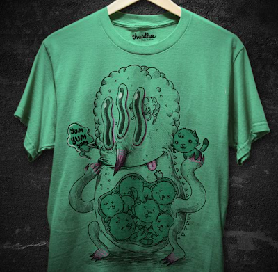
Fresh off his print this week at Threadless, Jacopo brings us yet another piece incorporating his apparent love for the odd, as well as red-tones on creme. This time, it's Welcome to Fabulous Las Cerezas. It's a play on the bizarre world of gambling... the classic symbols that slot machines would display without making a whole heck of a lot of sense... a foreign lexicon of winning and multitudes of fruit. Sure, the winner here should be stoked that his life did not give him lemons, but instead bowls upon bowls of cherries, but the relation of these items to winning money always eluded me. Obviously here, it's quite more literal. I really like how the fruit spills out and over from the machine, and the vintage style required to get this joke across makes it incredibly attractive as well. I'm local-ish to Mohegan Sun, and if this were a modern slot, not only would it be nothing more than an odd little video screen, I could easily be getting a jackpot of wolves. And that is not safe. All in all more excellent concept work from a guy who seems to know how to make his seemingly few designs count.

One of the things that made me happiest this week was shirt.woot's "Japan" derby. The contest ended without being the cliché-ridden mess that the theme evokes in the minds of those familiar with woot, and that alone is a huge victory. Still, it shouldn't be much of a surprise that my favorite of the week was left out of the fog. I actually agree this time: Takoyaki! Om Nom Nom by mikan36 is admittedly a very niche piece (not to mention that my blood boils red hot at the sound of "nom" and "num". It's grating to me). Still, what I do love here is the style... it's very sketchy, in a way that both recalls Japanese art as well as some of the sketchy style I love from people like Monsieur Pimpant. It's a little vignette of life, simply and attractively done. It's not for everyone, but I can see myself wearing this in a heartbeat. My only suggestion? If the sketch was just a biiiit thicker (line-weight-wise) or darker, it'd be all the more visible against the bold red (gosh, shocking palette for me, eh?). As it's mocked, I worry about fade-in.

With autumn comes inevitable things. Such as more "horror" contests than you can shake a severed zombie limb at. It's a tiresome affair... so much gratuitous blood, so many zombies (seriously, there are OTHER SCARY THINGS!) and so much grotesque art that is heavy on skill and detail but doesn't really put much stock in things like "wearability." As such, Threadless is likely to be my favorite of the batch this year again, as their designers tend toward more diversity across the board anyway. Stuff like pakpandir's "The Four Horsemen" has all the havoc and creepiness you want from horror. Reapers on zombie horses. Raging storms. Faces of Doom hidden in swirls. But the linework is still tasteful, the palette, in its single-color glory, is not too gory or gaudy (the blue hue used is actually very neutral), and the flow makes it imminently wearable, almost giving a beauty to the mayhem featured here. Which is a good thing, because this is the sort of horror that is unavoidable... best to look at it in awe. Given last year's Horror winner, this is an excellent road to take to "Loves" success, and could serve a pointer to other competitors... keep it skilled and original and wearable. That's what will win.

Of course, the other side of autumn is all about the colors, and that's captured quite well in JadenKale's "Tea Leaves," which is, like Wise Old Master (see the header), up for voting at Goodjoe. This has seen its way around the block a time or two, and I don't believe I've given it any love prior, but I feel it's a really rich design, because of its style. The chunky minimalism gives it a throwback crispness, but there's a lot of intrigue too. The bunches of color that make up the foliage are presented in disjointed chunks. The pot's handle is a root from the tree. The tying the two together makes perfect sense to me... fall has a crispness, and what better time to enjoy some tea or other hot beverage? Winter is just too cold sometimes... the drink becomes less of a joy and more of a necessity. I am, also, drawn in to how simple and, again, minimalistic the "fall" aspect of fall is done... three leaves, cookie cutters from the swaths of color, dance in the steam of the pot, as leaves blow in the wind. It ties together well in a simple but creative way. Definitely worth the print for this time of year.

Wednesday, September 16, 2009

Noodle No More

So, I am not going to lie, I find "Dinner is Ready" by jacopo to be one of the most charmingly weird fun shirts in the Threadless catalog. As I said long ago in a contest watch, it has this whole world laid out in this one scene... a bizarre, magical world, and one that you can imagine all the inner workings of bit by bit. I always like that in shirts... something so offbeat that it can't be anything but the designer's imagination, but so accessible that you're drawn in to make it familiar, instead of blocked out because you "don't get it". If you find that you don't get it too often, maybe you're the one missing something.

That all said, I feel that in retrospect, dumping pasta on your enemies might be the wrong way to go. Sure, you might scald a few, but once it lands, you've just given them a heaping pile of carbs, and regardless of the hype against them in recent years, we all know that carbs do give us energy. And I'd think that's the last thing we'd want to give our enemies. Possibly a bad call, viking-gnomes.

Monday, September 14, 2009

Contest Watch: Updates #51-75

#51: There is So Much to Learn
#52: Taipei Rocks
#53: Dinner is Ready
#54: Technophilia
#55: Kitty Gratis
#56: The Ghost-Town Cactus Trio
#57: Binary Song
#58: All Dinosaurs Go To Heaven
#59: Tea Leaves
#60: Wise Old Master
#61: Cruel Joke
#62: Original Sin
#63: The Lost Gondolier
#64: Kleptonaut
#65: Song Bird (Tilteed)
#66: Spaghetti
#67: Uh-Oh Spaghettios (formerly "Inspired by Still Life with Woodpecker")
#68: The Incredible Flyingcontraptionofwaste
#69: Deep Blue Destroyer
#70: Final Approach
#71: Battle of the Ironclads II
#72: Spaghetti Western
#73: Lunar Escape
#74: Metal on Metal
#75: The Post-Apocalyptic Blues

Delightful Burnt-orange Hogboy

About 6 months ago, we here at Singularitee sent out an ultimatum to Design by Humans: get an orange blank, in order to do justice to the wonderful Hogboy design Taipei Rocks. We suggested that they could simply dye a bunch of white blanks for the single tee. We even invoked the most horrible fear any site could have: a designer taking their awesome work to shirt.woot instead. And now, nearly 6 months later, we are happy to say DBH has totally delivered.

Taipei Rocks looks just as rockin' (and likely just as Taipei-esque) as I could have hoped for, and while I certainly don't believe I alone influenced the decision, I'm nevertheless stoked that the decision was made. Really, that rich sky blue contrasts so boldly and wonderfully with the orange, which itself is rich and carroty instead of the blindingbright (yet still wonderful) orange of many sites. And of course, all the character whimsy is still here. I want to take a moped ride with mustache-man. I want to have a guitar-off with the big blue robot who looks like a security camera (if only because win or lose, I'm sure it would involve a high-five resulting in rainbows). More than anything, is that a street sign for ice cream? Dude, Taipei is SO my sort of place. Except they might want to check those pink clouds. They look cool and all, but that might not be totally healthy.

For the next 8 hours or so, you can snag this bad boy for only $15, which is an amazing deal for a new shirt color, one of the best quality blanks in the business, and a wonderfully imaginative design. But then, if you miss it, I promise this one will be quite worth the $20.

Saturday, September 12, 2009

Prize Claim Notice

Some contest updates:

Golden & Darels, I will be ordering your DBH tees this coming week. When you have chosen your desired piece, do be sure to email me at 5songsinc -at- gmail.com with your size, selection, and address.

Original winner eHalcyon has given up his shirt for reasons best known to his silly Canadian head, so I have redrawn, and ressamc is our new winner. Please send your preferred size, address, and shirt color (check goodjoe for those) to the above email address

As for the rest of you, look out tomorrow for a new Print Review!

Thursday, September 10, 2009

Now it's Overhead

Hey, just a quickie: tonight Teefury has totally blindsided me by releasing BlakeB's "There's So Much to Learn," a former contest-watch favorite and an unforgivable oversight over at Threadless to miss out on it. It's only available for the next 24 hours, and perfectly timed with classes beginning, so buy three. One for you, and one for your two favorite teachers.

Contest Watch: Week of September 3

Those of you prone to being awesome might be interested to know, before we get deeply into this week's new entries, that the superawesome "An Island Unto Herself," by Grayehound, is up at Threadless, and the sillyawesome "Apparition of the Grouchy God" by Aphte, once printed at Teefury, is making the rounds at DBH. Check 'em out!

We start at Teextile, with a piece that is far more about choices than design itself... beadler's Burning Mountain. The art is nice, don't get me wrong, but this wins on two levels for me: First, the colors really do pop wonderfully... the red texture against the yellow does look quite fiery, and the effect against the stark black and white is stunning. The tee blank showing through as the titular mountain feels like just one more color added in, which adds to the overall impact. Secondly, there's the placement, big and bold and all but eating into the side of the shirt. Teextile has been doing a lot of such side-placements, and I'm quite interested to see one up close and personal. Hopefully this will be the one!

A bit reminiscent of the big black splatter background in beadler's piece are the little dudes in xiv's Diamond Providence, an entry into one of the community contests that make Threadless so interesting in the design world. The idea of this one is remaking someone else's old piece (with their permission, obviously), and the designer really made it his own and made it awesome. There are certainly elements of the original (which is linked in the sub itself)... the rainbow triangle guys, the diamonds, etc... but the remake hits way more of the right chords with me. I love the texture the piece has, with its many gradients and halftones adding character, not overloading the tacky quotient as the technique can do. I love how crazy the whole thing is, with the characters looking vaguely maniacal with glee, mouths spewing oil or chocolate or something. The medium is just always conveniently perfect for a well integrated character piece, and the way these flying triangles come to life against a canvas of clouds and diamonds makes for a fun and well thought out piece.

Yum Yum Yum is another character study, this time by Kid Ghost. It's about a funky little monster dude. It makes use of minimal color. Oh, and the guy eats cats. Adorable little kittens, which become adorably dead in his stomach. Admittedly, your appreciation will hinge on your feelings for kitten-eaters. Living with two wonderful cats, though, I can still sympathize with this big happy dude. Especially with how happy his prey seems in his stomach.

Wrapping up Threadless this week is hard, because there were lots of great pieces that could easily have deserved a mention here, but our final piece for the week from there, Mushroom Escape by Digaster, deserves a shout even among such quality. I do admittedly love the earthy quality of the colors used here... it looks like the crossing from summer to autumn, or the verdant and dead fields peppering the landscape when you look down from an airplane. The shape and shapes also give a bit of a feel from another piece with a powerful palette... Timberland. The differences are obvious, but I feel there is a similarity too, in the way many of the bits are laid out and the way the lines (especially at the base and in the clouds) are drawn. Though the piece is apparently about escape, the overall feeling I get is peaceful, as a gentle, quiet woodland scene would likely be. Still, there's a bit of magic in the floating mushroom balloons, as if we're witnessing some fairy ritual heretofore unseen by mortal eyes. For me this is predominantly great for its pure artistic values, but I also do think there's a lot of potential story here that could also lead to potential draw.

Finally, we wrap up at shirt.woot, after an incredibly blue week of a blues derby. To me, the entire contest should have ended with jewelwing's The Old Blue Whale. Ok, so it's technically a beluga, but there is far too much great going on here to get tangled in semantics. I like the idea of "whalesong," intentional or not... knowing the designer's past work, she may just love sea life and animals performing music. What was definitely intentional was touching on Picasso's "Blue Period" here, though. Too many designers went for blue superficially, but here the concept of a blue study is understood, and furthermore parodied. It gives a twofold punch, because the art is well rendered... I love the painted textures here... but there's also the joke within the art. Maybe it proves my nerdiness to enjoy art puns so damn much (to my defense, at least I don't wet myself over Helvetica), but even without really understanding where the whale comes into the guitarist pose, it's still a piece that I can't help smiling at. And hopefully you will too. I love to leave you smiling.

Tuesday, September 8, 2009

Dressed to the Nines

EDIT: AS OF EARLY 9/10, THIS PROMOTION IS STILL RUNNING! CHECK IT OUT BEFORE THEY PULL THE PLUG!

Hot tip: Threadless is celebrating the wonderful date of 9/9/09 with a presumably one-day sale of $9 tees. That's half price, guys. You can double your Threadless awesome. And surely everyone who's read this blog even infrequently knows Threadless tees are worth it, especially on sale.

My source is confident that ALL TEES will be on sale, which is amazingly convenient since this week there were no less than 5 stupendous new selections, two of which were past contest watch faves. For starters, we have Ivantobealone & Montro's collab, Wah Wah Wahhhhh, which is the ultimate Debbie Downer tee. I originally lauded it as better than Threadless' classic Spoilt, because simply put, the humor here is way more spot-on. This is hefty cynicism at its finest, while Spoilt is more about being a dick for the sake of being a dick. This, instead, is all about the truth, even when it is tough to swallow, and disillusioning yourself from fantasy. Which can also be summed up as being a dick, but to a more noble end, I feel. Also, more importantly, this is universal. Everyone can relate to the "tough love" humor here, while the prior is really only meaningful if you're a movie fan. But more than anything it's style that wins the day. The bright colors and nostalgic whimsy of the illustration make for a suckerpunch when you finally check the shirt out.

On the other hand, there is the much moodier and darker colors of Song Bird by Quister. At first blush it amounts to nothing more than a visual pun, but the fact is, at first blush many wouldn't even catch that pun. The designer hides the elusive bird in a wonderful canopy border, with a deep jungle behind it, but more importantly he hides that musical element within the bird itself... it looks exotic and intentionally so, like so many quirky denizens of such areas, so the fact that it is built from a music note, the vehicle for a quick punchline, is really a "wow" moment instead of an "awwww" moment. It's too beautifully rendered for the weak pun to become a con.

While these won't be $9 forever, they certainly will be awesome (and if I recall correctly, they push the Contest Watch official tally over 50, so hurrah for that). I certainly recommend either... they look to have come out wonderfully. More's the luck if you can snag one while the price is cheap. The shindig should be starting at midnight central: that's about a half hour, guys. Get your game faces on.

Monday, September 7, 2009

American as Baseball and Contests

Well, I promised something special on Monday. I should probably have my wrist slapped that it ends up being shameless self-promotion. My design has printed this week at Goodjoe.

The Best of Friends fits the Goodjoe catalog by promoting the ideals of friendship despite differences, by fostering sportsmanship and consumption of meat products, and by being gosh darn American. But I'm obviously biased. I designed it originally to evoke summer, and the two characters make me smile. If you happen to enjoy it yourself, I would be honored for my work to be on your chest. And hey, comment below with your favorite baseball team and thing-to-put-in-a-hotdog-bun, and you could win one yourself. Don't forget BOTH, or I'm afraid I will feed your entry to my wild capybara herd. I'll be drawing Friday, so hurry up if you're interested.

But if it doesn't particularly make you smile, there's more. I'd like to announce the editor's selection picks for my Mecha-Labaw contest. Reader Darels will be getting a DBH shirt of his/her choice for a compelling defense of Zebra-as-Pet, as will Goldenthorn, for not only being the only person to introduce me to a new and awesome species, but for subtly implying that I might end up being subjugated by massive millipede-esque armies if I didn't select her. For all of our sakes, I felt it would be for the best. As I do not believe I have won the official contest my contest was based on, I cannot afford to make a random selection, but I will happily select one if I am informed otherwise. For now, if Darels and Goldenthorn could email me at 5songsinc@gmail.com with their selected shirt, size required, and shipping info, and then comment here that they did so, it would be awesome. I'll have your prizes processing next week.

Sunday, September 6, 2009

What the Cluck pt. 2

After months of waiting for full support at Cameesa, waiting for the shirt to print and come in, and waiting for the shirt to reprint so it wasn't bizarrely pea green, I was beginning to despair that I might never be able to excitedly inform y'all that Coq Music is officially for sale at the crowdfunding site... so much so that my official update has long been delayed even past its true launch. Still, this is a tee I've been truly stoked for, and for those of you who may not have seen it yet, I hope you will enjoy. It's glorious. The colors are wonderful, the style is whimsical and appealing, and the concept is totally out there, which pretty much guarantees a home run for me... really, I was sold from the start on those hip glasses on the rooster. What I really love about the designer, though (blog favorite Monsieur Pimpant) is his natural, rough, loose style. He designs so organically, using the tee as just one more sketchbook page, and at his best he creates a vignette that captures the imagination... the possibilities of what this piece could mean are pretty endless, and imagining that world doesn't get old. What sort of society had giant birds commanding tiny men to wind their Victrola? What sort of music are they even listening to? We can only hope it is not the chicken dance.

Saturday, September 5, 2009

Guac'in to the Oldies

Y'all may have noticed that Shirt.woot has been doing this little thing where they bring back classic shirts for a week to reprint, but if you haven't, now's as good a time to find out as any. Their latest reincarnation is Avocado Man, relevant as being my first shirt.woot regret (you best believe I've got one coming this time), but also for being only their third "classic" yet already being their first to not survive a single reckoning. What I love about this little guy is just his sad, calm charm. He looks like he could use a hug. That and a love of avocado made him a must have, despite my normal aversion to kanji-on-my-chest. But even better than him, his printing has an even more important implication: namely, it implies that woot isn't going to solely be bringing back amazing sellers for their Redux/Remix project. To me, this is very important, because woot's biggest failure is the way it seems to not take into account quality in so many of its day to day dealings, but solely sales. Seeing a less successful print get another chance in the sun implies to me that shirt.woot wants to use this avenue to bring back shirts that truly deserve another showcase, not just whatever will make them the most repeat money. If so, it's a small but definite step toward a shirt.woot that understands it needs to be more respectful of the artists they're supposedly supporting, instead of just allowing any old thing to make a grand.

That all said, these ARE limited editions. Every Monday, a new Classic pops up along with the new woots, which means this particular one is only gonna be with us a little over a day longer. Pick one up now, and cross your fingers that next week continues the relatively strong lineup of classics so far.

Friday, September 4, 2009

One Singular(itee) Sensation

We're a little late (about a week, to be precise) in announcing this, but we are happy to note that, for the first time in their approximate half-year span, Shirtfight and I have found ourselves in agreement. Their pick from their first dual-week battle ended up being the same as my personal favorite: mathiole's "Sensationalism." As I commented mere weeks ago, this is so epic because of how crazy and cluttered it is, much like the sensationalist stories and speakers we've become victims to these days. It represents the same furor and insanity and rage and mindlessness that the word itself represents. It's a bold tee, and it highlight's one of Shirtfight's strengths... not just any site would take the risk to print this.

You'll note in the mock up that there are two colors available: I'm recommending grabbing men's if at all possible, since it'll be on silver, as opposed to light pink, the color of choice for the women's option. Regardless of which you choose, however, I'd definitely grab one within the next week to get it for a mere $13 bucks. Which, let's be honest, is a bit of a sensational deal.

Thursday, September 3, 2009

Contest Watch: Week of August 27

We at Singularitee would like to congratulate Mecha-Labaw for doing the impossible and taking the 10K title from CollisionTheory. It's well deserved. We'd also like to point you to some former CW favorites now fighting for homes elsewhere. Robbielee is looking for a well-deserved second Threadless print with "Battle of the Ironclads II," and Omnitarian's "Float On" is up for voting and floating at Tilteed. These are two utter classics for me, so go give 'em some lovin'.

Going with the idea of classic, Design By Humans is currently hosting "In Gastropodous Fashion" by Slaterock. It's third in a series of designs featuring humans clad in animal-inspired regalia, and half the fun of the pieces is viewing these new fashions, like a runway challenge meant to jumpstart a designer's imagination. In this case, I don't know if I'm gonna run out and buy the helmets and puffy vest (though the long cloak on the leading figure looks pretty awesome), but seeing it makes one wonder how it would come across in real life. Also aiding this piece is the sci-fi, almost apocalyptic feel. The humans are either tiny or the snail is huge, which makes the piece seem otherworldly, and the palette is dark and earthy, which makes the fashionistas seem alone except for their giant pet. A gorgeous illustration and a thought-provoking one, as well.

More frequently in fashion than snails and slugs are flowers. There are a million directions you can go with flora of all sorts, which should make it more surprising that shirt.woot's derby of that theme would be so bland, but frequent readers likely have no such shock. A few standouts, of course, languished in non-printable range, one of which being Lucky1988's "A Delicate Floral Bouquet," arguably a "tea-shirt." But while I'm busy cracking myself up with bad puns, you can easily see things such as the wonderful color choices popping out. I enjoy how the otherwise nonsensical elements flow together... the idea of a floral tee, through to the proper bunny gentleman drinking tea, and back to the idea of a bunny in the wild... where better to imagine one than a flower-filled meadow? As always, the designer brings us a piece with skilled linework and somehow, as always, incorporates a smile into his work. There's always a bit of that joy mixed in with all the other totally awesome elements.

This week, Threadless is going for simple, it seems, so my reviews feel like they will be equally simple. After all, what can one truly say about ekirkdesign's "Guess Again" that isn't readily evident? It's not complex, nor is it expertly executed. Still, it feels like it fits perfectly in Threadless' humor catalog. It actually got an audible laugh out of me, and that in and of itself is a lot. The piece does what so many other pieces do, in twisting a nostalgia into something further (and often darker). What I love here, though, is it is nostalgia we all own, not a copyrighted character or registered trademark. Anyone growing up with the old standard joke books will get what's going on in this otherwise morbid scene. The twist on the joke is enough to carry this... indeed, making this anything more than it is, imperfect though the art is, would overload it.

On the other hand, jameses.x benefits from adding more depth-of-concept into his "Nobody Wants to Be a Lonely Gingerbread: Reloaded." The title leads me to presume I missed an original version, but that makes no sense to me, because I cannot see how an original version would not have been printed immediately. It is beautiful and sad all in one, the sort of piece that you might feel guilty wearing because it might fill someone's heart with the weight of loneliness. It definitely straddles that line of endearing and exhausting for some of the hopeless romantics out there. Again, though, the concept is what shines here. The art is also skilled, but remains simple, to not overpower that concept. I like that there is enough here to make it quite clear what's going on, but it doesn't make it a no-brainer or insult intelligence like an explicit caption would. I also, for reasons unknown, rather like the cracked egg and leftover dry ingredients behind the pan... it gives a feeling that the gingerbread man was very eager to get through his task... the loneliness was too much to bear. Threadless has a few designs that touch on this sort of theme, but none quite so elegantly and beautifully.

We end off with more bug-riding, this time a Rhinoceros Beetle, in Aphte's simply named "Rhinoceros Beetle Knight." It's a knight on a rhinoceros beetle, and that alone is weird and wonderful enough, but the style makes it twice as fun. The accents are pretty great also, with the fly buzzing behind with the knight's colors, and the villagers running behind, praising the knight's return. The entire story is pretty much encapsulated right there, but there is so much background we'll never know that makes the piece dreamy. I'd also recommend checking out more of the designer's work... he's got an insane amount of work in the running currently, and almost all of it is great.

Wednesday, September 2, 2009

Calooh, Callay!

It is a rarity, yet a heartwarming one, to see shirt.woot bring us something we've been anticipating from another site. Consequently, we were ecstatic to see The Walrus and the High Wheeler pop up yesterday as their daily offering. Frequent readers may remember this from long ago... the second Shirtfight contest, if I remember correctly... and while woot is normally one to pass over good work to another company's eventual gain, this time they take Shirtfight's loss for their own benefit. Theinfinityloop's piece is gloriously odd but unmistakably charming... the pinniped on the penny-farthing looks like the most proper old chap ever, and simply makes me smile. The little crab is wonderful too, and an enjoyable sight-gag to catch after the main piece. I truly loved this most on white, but the creme blank will not be a hindrance to me picking this up one way or another. It's just that fun, and makes a great addition to what has been a surprisingly solid week of woot tees so far. Presumably to make up for what will be a painful weekend.

As with all woot tees, I wouldn't presume this'll be around longer than the 14th, so pick it up ASAP. It's worth checking if you find this later, but wooters are never known for keeping the best work on the charts.

Tuesday, September 1, 2009

For sea's a jolly good fellow

Happy birthday to tee... happy birthday to tee... happy birthday Singularitee... happy birthday to teeeeee.

Yes, if memory serves me right, today is the one year anniversary of this here blog, and I'm expecting to bring you guys some new awesomeness every one of these first 7 days of September (that's all week, y'dig?) culminating with something awesome on Monday. Stay tuned!

That said, it is with mixed glee and sadness that we announce the fifth place finisher in the wonderous DBH10K... Umibozu, by thestray. This was one of two pieces I truly loved in the top-20, so I'm ecstatic to see it print, but the ecstasy was a blow to the chest when I finally saw it printed. It's too big, which is ironic considering how one of the selling points of the piece was the oversized design. As printed, though, it's too much... the scene of the creature rising from the deep now becomes the creature, not the rising. The backdrop helped frame the creature's immensity, and now it just looks gawky. On some of the smaller sizes, the ship is hardly even visible due to this scale decision. Also, there's a lack of color, due to the omission of the ship's brown. It's apparently due to a 3-color limit for oversized pieces, but it puts the knife deeper into this piece's heart. I can't honestly believe that DBH accepted this piece, and then put it in the running for 10K, without considering "can we print this as shown?" If the answer was "no," we should never have been allowed to vote for it. We should never have had it selected as a top-20 for a huge prize (can you imagine if this printed like this and also won 10K? Ludicrous!).

The good news, of course, is it printed, and for thestray, it's pretty amazing to make it to 5th in a contest like this to gain your first print. It also looks way better than it did when I originally saw it, which is why I posted the unofficial picture above (the official model poses look unforgivable on the magnitude of Judas betraying Jesus). Therefore, even as it is, there will be some who will still wear the amazing art as a less amazing tee. I'd even pick it up adequately sale-priced. Some people might even like it better this way (though I don't know who). Still, it hurts all the same. It's a huge blow to DBH's credibility and reputation as the best place to get an oversize print (or any artistic piece) printed well, and it seems like a failure that could have been avoided thusly: rejecting the piece early on for not fitting the print capacities. This shirt was to be awesome, but it was not what anyone who voted it into 5th voted on. There's a part of me that feels every fan of this shirt should be obligated to write to DBH customer service. They didn't give us what we were told we were going to get with our vote, and that is what customers deserve and have a right to: what was advertised. But then, who can really expect the site to care about quality if it wouldn't give that quick perusal to start with. I mean, this is a contest decided on pure votes. Quality never need enter into the equation.